Table of Contents
You’ll often ask yourself, what’s considered the best kitchen colors for small kitchen areas. To make a small kitchen feel bigger fast with light-reflective colors like warm white, creamy off-white, pale greige, or soft mushroom, which bounce daylight and cut visual breaks. For a fresh, airy trend, choose misty sage or dusty blue-gray to calm the space without shrinking it. Keep uppers bright, and add controlled contrast with charcoal lowers or matte-black hardware. Use eggshell or satin for washable glow—and keep going for easy pairings and pitfalls to skip.
Quick Picks: Best Colors for Small Kitchens
If you want a small kitchen to feel bigger fast, start with light-reflective, low-contrast colors that bounce daylight and visually push the walls back. Choose warm white, soft greige, or pale mushroom for a current, cozy-neutral backdrop that won’t chop up sightlines.
For a fresher, airy vibe, try misty sage or dusty blue-gray; color psychology says these calm tones lower visual noise and make tight spaces feel orderly.
Love contrast? Keep it controlled with a charcoal island or matte-black hardware, not dark walls. Go satin or eggshell paint finish on walls to maximize wipeability and glow, and use semi-gloss on trim and cabinets for extra bounce.
Repeat one hue across walls, cabinets, and backsplash to streamline the room.
How to Pick Small Kitchen Colors (Light + Undertones)
To make a small kitchen feel bigger, you’ll want light-reflecting hues—soft whites, airy greiges, and pale sage—that bounce daylight and keep corners bright.
Then match undertones carefully so your paint, cabinets, and counters stay cohesive: warm with warm, cool with cool, or intentionally balanced.
Get those two choices right, and your space looks cleaner, larger, and right on trend.
Choose Light-Reflecting Hues
Because small kitchens thrive on every flicker of brightness, you’ll get the most visual “square footage” from light-reflecting hues that bounce daylight and fixture glow across walls, cabinets, and trim. Start with soft whites, airy creams, pale greiges, or misty pastels in satin or eggshell so light skims instead of sinking in.
If your cabinets stay darker, keep the backsplash and upper walls luminous to lift sightlines and reduce visual clutter.
For a modern punch, layer in controlled contrast: try bold accent walls in a higher-sheen finish, or use vibrant accent colors on a pantry door, island base, or open shelving. Stick to clean, high-chroma versions of your palette so accents feel crisp, not heavy.
Finish with reflective metals and glossy tile to amplify the glow further.
Match Undertones Carefully
Even the brightest paint can look “off” in a small kitchen when its undertone clashes with your fixed finishes. Check your countertops, cabinet stain, flooring, and backsplash first, then match paint to their warm, cool, or neutral base.
If you’ve got creamy stone or honey oak, choose warm whites, soft greiges, or muted clay; they’ll feel welcoming and expansive. With stainless steel, marble, or crisp quartz, lean into cool whites, pale grays, or airy blue-greens for a cleaner, larger read.
Use Color psychology: warm undertones energize, while cool undertones calm visual noise. Sample swatches morning and night under your bulbs.
Finally, prioritize paint durability—washable satin or eggshell keeps light colors looking fresh in tight, high-traffic kitchens.
Bright Whites That Make a Kitchen Feel Bigger
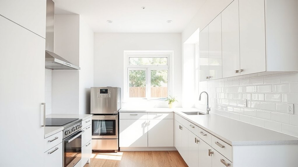
While small kitchens can feel boxed in by shadowy corners, bright whites bounce daylight across every surface and instantly make the room read larger. You’ll amplify that effect by painting walls, ceiling, and trim in the same crisp white, minimizing visual breaks and pushing boundaries outward.
In Color psychology, clean white signals order and calm, so countertops and open shelves look less crowded. Pair it with glossy subway tile or satin cabinet paint to reflect more light and hide tight clearances.
Dial in Kitchen lighting: use 3000–3500K LEDs, layer under-cabinet strips, and choose simple reflective hardware in chrome or brushed nickel. Keep grout, switch plates, and vent covers white so nothing chops up the sightlines.
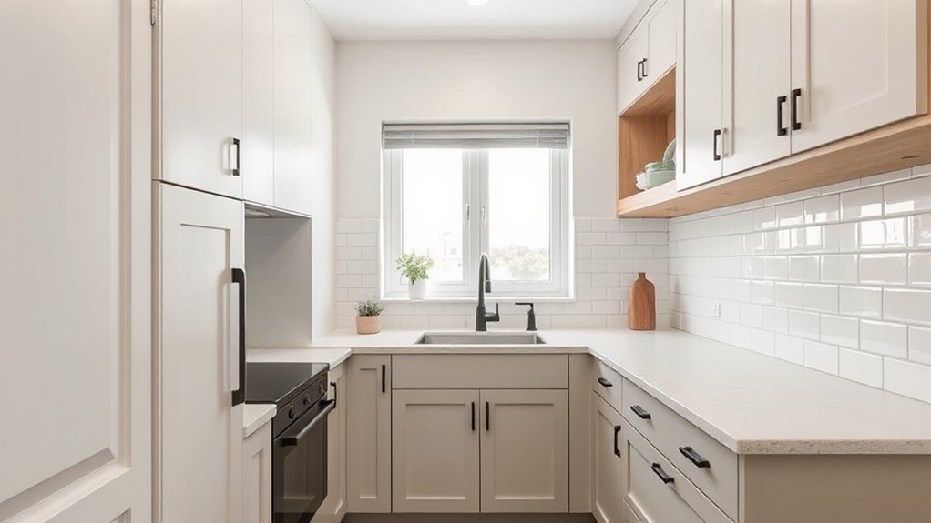
Warm Off-Whites (Cozy, Not Sterile)
If bright white feels a bit too sharp, you can switch to a warm off-white with creamy undertones that softly reflects light and still keeps your small kitchen looking open.
These hues add a subtle glow that reads cozy, not sterile, especially under warm LEDs and daylight.
Pair them with natural wood cabinets or open shelving, and you’ll get a modern, space-savvy contrast that’s trending now.
Creamy Undertones That Glow
Because small kitchens live and die by reflected light, warm off-whites with creamy undertones give you that soft “glow” effect without tipping into sterile builder-white. You’ll notice they bounce daylight around corners, blur hard cabinet lines, and make tight galley layouts feel calmer and wider.
Choose shades with a gentle yellow-beige base instead of gray, especially if your light bulbs lean warm. On walls, a satin or eggshell finish keeps the color luminous while hiding scuffs.
For cabinets, pick a slightly deeper off-white so door profiles don’t disappear. Then layer glowing accents—brass pulls, honeyed pendants, or a creamy backsplash—to amplify warmth without darkening the room.
Keep counters and floors a touch lighter or mid-tone so the off-white stays airy, not flat.
Pairing With Natural Wood
That creamy off-white glow looks even richer when you set it against natural wood. In a small kitchen, this pairing adds depth without stealing light, so your space feels bigger and warmer.
Choose Natural wood textures on open shelves, stools, or a slim island base to break up off-white cabinetry and keep the palette airy.
Go for pale oak or maple to stay modern, or walnut to add contrast while still reading cozy. If you love rustic finishes, limit them to one or two accents—like a reclaimed hood trim or beam—so the room won’t feel heavy.
Tie it together with brass or matte black hardware, and repeat wood tones in cutting boards or frames for a curated, trend-forward look.
Light Greige and Taupe for Small Kitchens
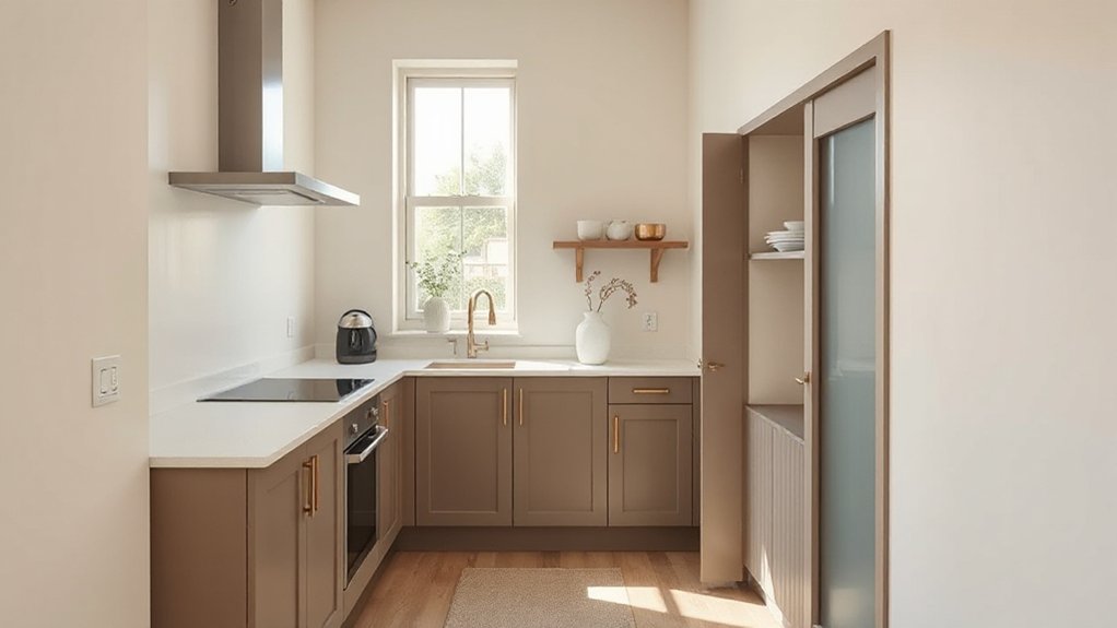
While stark whites can feel flat in a tight layout, light greige and taupe add soft depth that still keeps your small kitchen looking open. Choose a warm-leaning greige if you want a cozy, modern neutral; pick a cooler taupe to sharpen edges and make cabinetry feel lighter.
Use a satin or eggshell finish to bounce light without highlighting wall texture. Let your lighting fixtures do the sparkle work: brushed brass or matte black adds contrast, while glass shades keep sightlines clear.
Pair these shades with high-reflectance countertops and simple, continuous cabinet fronts to reduce visual breaks. For tile patterns, stick to elongated subway, vertical stack, or small-scale herringbone in tonal mixes so the room feels taller, not busier.
Add one dark accent for definition.
Soft Blues That Keep Small Kitchens Airy
If you want color without shrinking the room, soft blues give your small kitchen a clean, airy lift and still read as a modern neutral. Lean into misty sky, powder blue, or gray-blue to bounce daylight and visually push walls back.
Color psychology matters here: blue cues calm, cleanliness, and order, so your counters and open shelves feel less busy. Keep trim and ceilings crisp white to sharpen edges and boost contrast without heaviness.
For cabinetry, choose a pale blue on lowers only to ground the space while keeping uppers light. Consider paint finish options: eggshell on walls for soft washability, satin on cabinets for durability, and a matte ceiling to hide glare.
Pair with brushed nickel and light oak to stay on-trend.
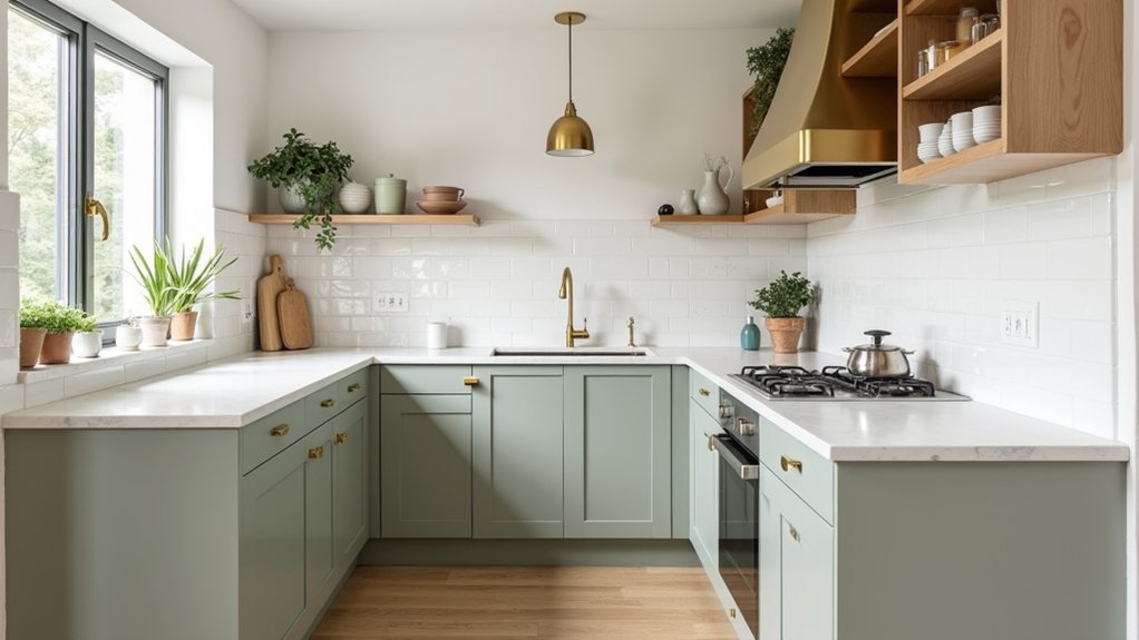
Gentle Greens for a Fresh, Light Look
Because green sits right between warm and cool, gentle shades like sage, celadon, and pale olive freshen a small kitchen without closing it in. You’ll notice these airy greens bounce daylight softly, reducing harsh contrast and making tight corners feel calmer and more open.
Lean into garden inspired palettes by pairing green with creamy whites, light oak, and brushed brass for a modern organic vibe. If your space lacks natural light, choose a gray-leaning sage to keep it crisp rather than murky.
Add pastel accent options—blush linens, butter-yellow canisters, or a powder-blue runner—to keep the look playful without visual clutter. Finish with leafy herbs, ribbed glass, and subtle veining in counters or backsplash so the color story feels layered, not busy.
Cabinet vs Wall Colors: What to Keep Light
Even though you can bend the rules, keeping at least one major surface—either cabinets or walls—lightest gives a small kitchen instant breathing room.
If your layout has lots of uppers, keep Cabinet finishes pale (warm white, soft greige, misty oak) so the room doesn’t feel top-heavy.
If cabinetry is minimal or sleek, you can go deeper on Cabinet finishes—ink, forest, charcoal—while holding walls to a clean, bright neutral.
Prioritize light walls when you’ve got low ceilings, limited daylight, or busy counters; the reflected light lifts everything.
Save richer wall color for kitchens with strong window light and simple silhouettes, and choose matte or eggshell Wall paint textures to reduce glare and hide bumps.
Keep trim and ceiling crisp.
Two-Tone Ideas That Add Depth, Not Clutter
You can add instant depth in a small kitchen with two-tone choices that stay crisp, not busy—think light uppers to lift the sightline and darker lowers to ground the room.
Keep it modern with soft-contrast pairings like warm white with greige or pale sage with charcoal, so the color shift reads intentional, not choppy.
For a bolder, space-smart move, try a vertical split accent wall that visually stretches height while keeping the palette controlled.
Light Uppers, Dark Lowers
While an all-one-color kitchen can feel safe, a light-uppers/dark-lowers palette makes a small space look taller and more grounded at the same time.
Keep uppers crisp—warm white, soft greige, or pale sage—so they visually recede and bounce kitchen lighting around the room.
Then anchor the base cabinets in deeper tones like charcoal, ink navy, espresso, or forest green to hide scuffs and create a “built-in” feel without adding bulk.
Choose a low-sheen finish to prevent glare on dark paint, and repeat the lower color in a runner or stools for cohesion.
To keep it modern, coordinate hardware and appliance finishes: brushed nickel for airy, matte black for graphic, or stainless to stay timeless and compact-looking.
Soft Contrast Color Pairings
Light uppers and dark lowers create instant structure, but soft-contrast two-tone schemes add the same depth with a quieter, less high-contrast look that suits tight layouts.
Pair warm white cabinets with greige walls, or pale sage fronts with creamy quartz, so edges stay defined while the room reads wider.
Use Color psychology: muted greens cue calm, dusty blues feel clean, and warm neutrals make compact kitchens feel welcoming.
Keep contrast within one temperature—cool with cool, warm with warm—to prevent visual chopping.
Add subtle cultural influences through undertones: olive and clay nod Mediterranean warmth, while rice-paper white and soft charcoal feel Japandi.
Repeat the second color in hardware or a runner to unify, not clutter.
Vertical Split Accent Walls
Because small kitchens need definition without visual noise, a vertical split accent wall delivers structure with a clean, modern edge. You paint one side a light neutral—warm white, oat, or pale greige—and the other a deeper tone like ink blue, forest green, or charcoal to add depth without shrinking the room.
Keep the split aligned with a cabinet run, fridge edge, or doorway so it looks intentional and elongates sightlines.
Add subtle Accent wall textures: limewash on the light side, satin enamel on the dark side, or a thin slatted panel for warmth. If you want more lift, use Vertical stripe patterns within the darker half in tone-on-tone paint or wallpaper.
Finish with matching hardware so the two-tone reads cohesive, not busy.
Small Kitchen Colors to Avoid (Better Swaps)
Even if you love dramatic color, some shades can visually shrink a small kitchen by flattening contrast and stealing bounce light. Skip heavy matte black or deep navy on most walls; they absorb illumination and make cabinets feel closer. Swap to inky accents only on a hood or island, and keep the perimeter a warm white or soft greige for lift.
Avoid muddy browns and yellowed beiges that read dated and dim; trade them for mushroom taupe or clay-leaning blush, which feels current and roomy. Color psychology matters: icy blues can feel sterile, so choose a misty blue-green instead.
Finally, don’t pick fragile flat finishes—paint durability counts. Choose washable satin or eggshell to keep light-reflective surfaces looking crisp.
Frequently Asked Questions
What Paint Sheen Is Best for Small Kitchen Walls and Cabinets?
Choose eggshell or satin for walls and semi-gloss for cabinets—it’s like armor for tight spaces. You’ll boost paint durability, use color psychology to brighten, and follow trend-aware hues that visually open your kitchen.
How Do I Match Kitchen Colors With Existing Countertops and Backsplash?
Match kitchen colors by sampling paint against your countertop and backsplash in daylight. Anchor Color coordination to their undertones, then choose one warm, one cool accent for design harmony. You’ll optimize space using light neutrals, on-trend.
Do Dark Floors Make a Small Kitchen Feel Smaller or Grounded?
Dark floors can make your small kitchen feel smaller if contrast is harsh, but they often feel grounded, like a tuxedo’s base. Use Dark flooring benefits with light walls, glossy finishes, and warm lighting to boost small kitchen ambiance.
How Can I Test Paint Colors Accurately Under My Kitchen Lighting?
Paint large swatches on poster boards, move them around daily, and check them morning, noon, and night for real Lighting conditions. Compare beside cabinets and counters; your Color perception shifts with shadows and bulbs.
What Are the Best Color Choices for Open-Concept Kitchens Connected to Living Rooms?
Choose cohesive neutrals (warm white, greige) to blend kitchen and living zones, then add muted sage or navy for depth. Use color psychology for calm flow; try accent wall ideas like tinted backsplashes or painted islands.
Conclusion
When you choose the right color, you don’t just paint a small kitchen—you open it up. You brighten with crisp whites, you soften with warm off-whites, you modernize with greige, you refresh with gentle greens. You keep walls light, you balance cabinets wisely, you add depth with clean two-tone contrast. Skip heavy darks and muddy undertones; swap in airy neutrals instead. Paint with intention, and you’ll cook, gather, and breathe easier.