Table of Contents
Choosing a kitchen backsplash for white kitchen spaces is one of those decisions that carries more weight than its surface area suggests. The backsplash is a relatively small element by square footage — typically the wall between the worktop and the underside of the wall units, a strip roughly 450mm to 600mm tall — but it’s one of the most visually prominent surfaces in the room. It’s at eye level. It’s the backdrop to the cooker, the sink, the coffee station, the activity zones where the eye naturally rests. Get it right and it completes the kitchen. Get it wrong and it’s the thing you look at every day and wish you’d reconsidered.
White kitchens make the backsplash decision both easier and more complex simultaneously. Easier because the white palette is a clean canvas that works with an enormous range of backsplash materials, colors, and finishes without creating obvious clashes. More complex because that same openness means there are fewer natural constraints guiding the choice, and the range of options available is genuinely wide. The decision therefore requires more active thinking rather than less.
The options here are organised by the quality of result they tend to produce rather than by price or material category — because the best choice for any specific white kitchen depends on the character of the space, the worktop material, the hardware choices, and what the room needs the backsplash to do aesthetically.
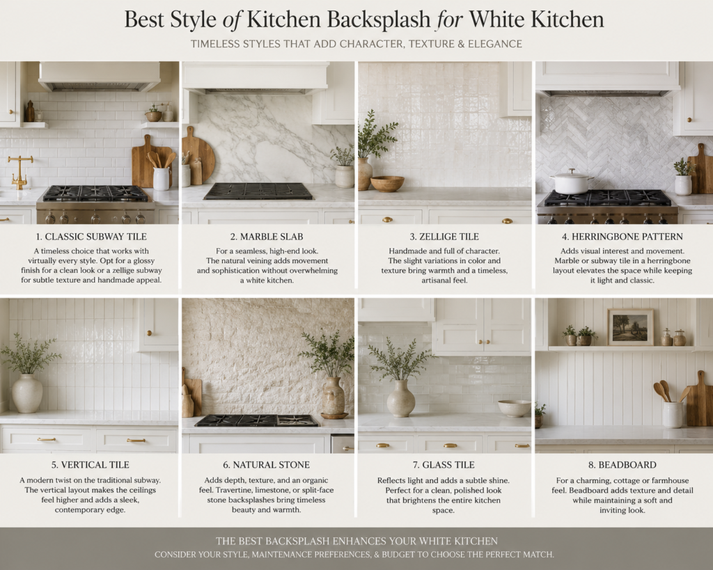
Classic White Subway Tile: Better Than Its Ubiquity Suggests
The white subway tile has been so thoroughly adopted as the default backsplash for white kitchens that it has developed a reputation for being boring — a choice made by people who couldn’t decide rather than people who decided positively. This reputation is partly deserved and mostly unfair.
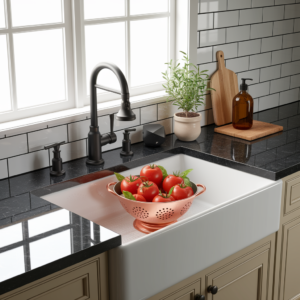
The reason the white subway tile became ubiquitous is that it works. It’s one of those solutions that achieves its ubiquity through genuine merit rather than fashion. The format — rectangular tile, typically 75mm by 150mm or 100mm by 300mm — produces a clean, graphic surface that reads as appropriately crisp in a white kitchen without competing for attention with the rest of the room. It’s practical, it cleans well, it provides a slight textural variation that prevents the kitchen feeling flat, and it has a historical depth — the subway tile has been in domestic kitchens since the early twentieth century — that reproduces trend products don’t share.
What distinguishes a successful white subway tile installation from a generic one is typically the grout color and the laying pattern. Standard white-on-white grout produces a near-seamless surface that reads as almost a continuous white panel — clean but visually quiet. Dark grout — charcoal, slate, or black — introduces strong graphic lines that make the tile pattern itself the visual element, which suits kitchens with bolder features elsewhere. A warm greige grout sits between these two and is currently the most popular choice, adding warmth and visual interest without the contrast becoming the dominant element.
The laying pattern matters too. Standard brick-bond (offset horizontal) is the default and works well. A vertical stack — all tiles aligned vertically rather than offset — reads as more contemporary and slightly more formal. Herringbone is the most graphic option and the most attention-grabbing; it works well as a feature panel behind the cooker but can be visually busy when used across the full backsplash run.
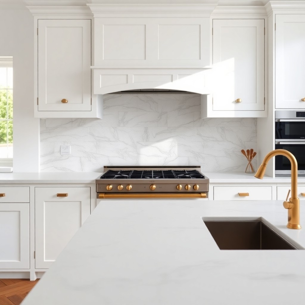
Marble and Marble-Effect: Quiet Luxury That Earns Its Place
Natural marble — or its convincing porcelain and ceramic equivalents — is the backsplash material that most consistently elevates a white kitchen from functional to genuinely beautiful. It does this by introducing a quality of material that paint, laminate, and standard tile can’t produce: the depth and variation of natural stone, the way veining moves through the surface, the slight luminosity of polished marble under kitchen lighting.
In a white kitchen, marble works for specific reasons. The white base tone of most marbles — Carrara, Statuario, Calacatta, each with its own character — sits harmoniously within the white palette rather than introducing a contrasting color. The veining — typically grey, sometimes gold, occasionally green or brown — adds movement and visual interest without departing from the neutral palette. A marble backsplash in a white kitchen feels like a continuation of the white rather than a departure from it.
The format choices within marble are significant. Large format slabs — running the full height and width of the backsplash in a single piece — are the most dramatic and the most expensive option, but they produce a seamless result that has a genuine wow quality. The absence of grout lines allows the veining to read continuously, which makes the material look considerably more expensive than tiled marble. Book-matching two adjacent slabs — positioning them so the veining mirrors across the join — is the premium version of this approach.
Standard-sized marble tiles in a 300mm by 300mm or 600mm by 300mm format are the more accessible version. The grout lines break the visual field but, in a fine grout joint well matched to the marble colour, the result is still extremely good. For a white kitchen where the budget has been allocated to the cabinet quality rather than the backsplash, this format produces the marble aesthetic at a fraction of the slab price.
The practical consideration: natural marble is porous and requires sealing, and even sealed it can stain and etch if acidic liquids — lemon juice, vinegar, wine — sit on the surface without being wiped promptly. For a heavily used kitchen where cooking is frequent and cleaning is imperfect, a porcelain tile that accurately replicates the marble aesthetic is a practical compromise that sacrifices very little visually while eliminating the maintenance anxiety.
Zellige and Handmade Tiles: Character Over Consistency
Zellige — the traditional Moroccan glazed terracotta tile — and other handmade ceramic tiles occupy a different aesthetic position from marble and subway tile, and they suit a specific type of white kitchen particularly well. Where marble reads as quietly luxurious and subway tile reads as clean and graphic, handmade tiles read as warm, crafted, and slightly imperfect in a way that’s genuinely desirable.
The variation inherent in handmade tiles — the slight unevenness of surface, the variation in glaze color across the batch, the way each tile reflects light differently — produces a backsplash that is alive in a way that machine-made tiles are not. In a white kitchen, this quality of warm imperfection creates a beautiful counterpoint to the clean, consistent surfaces around it. The kitchen is precise; the backsplash is human. That tension produces a room with more interest and more character than either element would have alone.
Zellige in a white or near-white glaze is the obvious choice for a white kitchen — it maintains the white palette while introducing the material depth and variation that the format provides. But zellige in other colors — a warm sage green, a dusty terracotta, a faded turquoise — can also work beautifully as a counterpoint to white cabinetry, introducing color in a way that feels considered rather than applied. The imperfect surface of zellige means even quite saturated colors read as softer and more settled than the same color in a machine-made glaze.
Handmade tiles more broadly — the kind produced by small ceramicists and specialist tile makers — offer similar qualities of variation and warmth at a wide range of price points. The important practical consideration is that handmade tiles have irregular edges and may require more grout joint width than machine-made tiles to accommodate the variation. This is not a problem — it’s part of the character — but it needs to be specified and understood before installation.
Glass and Mirrored: Light as a Design Material
Glass backsplashes occupy a niche position in the white kitchen backsplash conversation — they’re not the most commonly chosen option, but in specific situations they’re the best one.
The argument for a glass backsplash in a white kitchen is primarily about light. A large glass panel — typically a single piece of toughened glass, back-painted in the desired color or left as clear — reflects the kitchen back at itself, doubling the apparent depth of the room and amplifying the natural and artificial light. In a white kitchen with limited natural light — a north-facing galley, an open-plan space where the kitchen is away from the windows — a glass backsplash makes a measurable difference to the perceived brightness of the room.
Back-painted glass in a white that matches the kitchen cabinets produces the cleanest, most seamless result — a near-invisible surface that reads as simply clean wall between the worktop and the units. Back-painted glass in a color introduces the reflective quality while adding a tone — a pale sage that glows slightly, a very pale dusty blue that adds a hint of cool against the white.
The practical advantages of glass are significant: it’s the easiest backsplash surface to clean, it has no grout joints to manage, and a single large panel eliminates the complexity of a tiled installation. The disadvantages are principally practical — it needs to be made to measure, it’s heavy, and any chips or cracks require full replacement rather than repair.
Stone and Concrete: Texture as the Design Choice
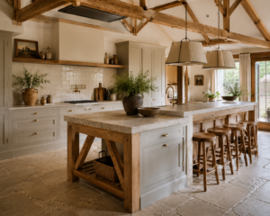
In white kitchens designed to have a raw, considered quality — the kind of white kitchen that’s more about texture and material honesty than about gloss and precision — stone and concrete backsplash materials produce a result that nothing else quite replicates.
Textured or bush-hammered stone — limestone, sandstone, a rough slate — introduces a completely different surface quality from the smooth, reflective materials above. The roughness absorbs light rather than reflecting it, creates genuine shadow and depth in the surface, and introduces a quality of geological permanence that suits kitchens designed around natural material honesty. Against white cabinets, a rough stone backsplash reads as the counterpoint material — the thing that gives the room tactile dimension and prevents the white from reading as sterile.
Microcement and concrete-effect panels perform a similar role in a more contemporary register. A microcement backsplash in a warm grey tone applied seamlessly over the full wall surface — with no joints, no tiles, a continuous surface — produces a kitchen with a minimalist quality that highly designed white kitchens often aspire to and rarely achieve with tile. The seamlessness is the key quality: the absence of grout lines and edges makes the kitchen feel resolved rather than assembled.
The practical notes: natural stone at the backsplash needs sealing and some ongoing maintenance. Microcement applied correctly is durable and easy to clean but requires a skilled applicator — poor application produces a surface that’s difficult to clean and deteriorates faster than it should.
The Bold Option: Pattern and Color
A white kitchen’s neutrality is an invitation to introduce a backsplash with genuine color or pattern — because the white around it provides a canvas that allows the backsplash to speak clearly without visual competition.
Patterned encaustic or cement tiles — the geometric and botanical designs that reference Victorian, Moroccan, and Spanish tile traditions — work particularly well in white kitchens for this reason. A single run of patterned tile behind the cooker, framed by the white cabinets above and below and the white wall on either side, becomes a piece of functional art rather than a background surface. The pattern is the feature; the white kitchen is the frame.
Color in a backsplash tile — a deep terracotta, a rich cobalt, a muted sage — functions similarly. In a white kitchen, a colored backsplash introduces personality without overwhelming the room because the white provides the balance. The rule of thumb is that the backsplash color should appear somewhere else in the kitchen — in a pendant light, a small appliance, a textile — to prevent it reading as isolated rather than curated.
The backsplash as the feature element is the approach that produces the most memorable white kitchens — the rooms that have a specific, distinctive quality rather than simply being well-executed versions of a standard formula. It requires more confidence in the initial choice and more commitment during installation, but the return on that confidence is a kitchen that feels genuinely individual.
The Worktop Relationship
Whatever backsplash is chosen, it must work with the worktop rather than independently of it. The backsplash and the worktop are the two primary material surfaces in the kitchen and they’re always seen together — their relationship determines the material quality of the kitchen more than either element in isolation.
A marble backsplash with a marble worktop is a material match — the same material on horizontal and vertical surfaces, which reads as resolved and luxurious. A marble backsplash with a dark timber worktop is a material contrast — which works if the contrast is deliberate and both materials are quality. A white subway tile backsplash with a white quartz worktop is a tonal match — the same value on both surfaces, which produces a kitchen with a clean, restrained character.
The combinations to avoid are those where the two materials fight for attention at the same value — a heavily veined marble backsplash with a heavily grained timber worktop, for instance, where both surfaces are doing something complex and the eye has nowhere to rest. One surface should lead, the other should support.
Fitting and Finish
However good the chosen material, the quality of the installation determines the final result. Badly laid tiles — those that aren’t level, have inconsistent grout joints, or have cuts that haven’t been carefully planned around obstacles and edges — undermine the quality of even a premium material.
In a kitchen where the cabinets have been carefully specified and fitted, the backsplash tiling should be at the same standard. This typically means a specialist tiler rather than a general builder, careful setting out before a single tile is fixed, a grout joint width specified and maintained consistently, and full-height cuts at edges planned so that the cut tiles are symmetrical and the full tiles occupy the most prominent positions.
The junction between the worktop and the backsplash — and the junction between the backsplash and the underside of the wall units — should be sealed with a flexible sealant rather than grout, because these joints experience movement as the kitchen settles and moves with temperature change. Rigid grout in a movement joint will crack. The right sealant, correctly applied and tooled flush, is invisible and lasts indefinitely.
These are not the details that make a backsplash look good in the first week. They’re the details that make it look good in the tenth year. And in a white kitchen that’s been invested in properly, the tenth year is the one that matters.