Table of Contents
Some clients come to you knowing exactly what they want. They’ve got a mood board, they’ve got references, they’ve got a Pinterest folder they’ve been adding to for two years. And then there are clients who know how they want to feel when they walk through their front door — and they need you to translate that feeling into something real.
Sarah and James were somewhere in between. They knew they wanted black and white. They’d seen it done well — a tiled floor here, a painted panelled wall there — and they knew the hallway of their Victorian terraced house in south London had the bones to carry something with a bit of drama. What they weren’t sure about was how to stop it looking like a chessboard, or a bathroom, or like someone had simply run out of imagination and reached for the most obvious combination available.
That brief — black and white, but make it feel considered — is actually one of the more interesting ones to work with. The constraint is tight enough to give the project real focus, and the variables within it are more numerous than people expect.
The Space We Were Working With
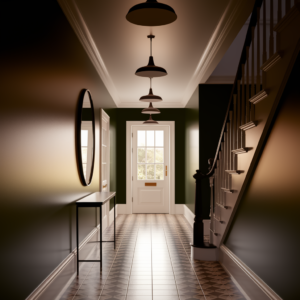
The hallway was typical of its era: long and relatively narrow, roughly 1.1 metres wide and about six metres from the front door to the kitchen at the rear. A staircase on the right-hand side about halfway along, rising to the first floor. Ceiling height just under 2.8 metres — genuinely excellent, and one of the first things we flagged as an asset.
The existing state was magnolia throughout, with a laminate floor that had been put down at some point in the early 2000s and had given up most of its structural integrity. A pendant light fitting of no particular character. A banister that had been painted white over what turned out to be reasonable original timber beneath. The cornicing was intact but had about four decades of paint on it, which had blurred its detail considerably.
Structurally sound, proportionally generous, aesthetically completely without personality. A blank canvas, essentially, if a slightly tired one.
Working Out the Palette Logic
The first conversation we had with Sarah and James was about what black and white actually means in a space like this — because it means quite a few different things, and they’re not all compatible.
At one extreme, you have the graphic, high-contrast approach: bold black and white floor tiles in a geometric pattern, white walls, black woodwork, strong and unapologetic. It works. It has real visual energy. It also has very little give — once you commit to it, everything else in the space has to respond to it.
At the other extreme, there’s a softer interpretation: off-whites and near-blacks, texture doing the work rather than contrast, pattern kept quiet or absent entirely. More liveable for some, but in a hallway — a transitional space rather than one you spend significant time in — it can end up feeling slightly tentative.
We landed on a position between the two, which is where the interesting decisions happen. A genuine graphic moment with the floor, which could take the drama because it’s the first thing you see and sets the tone for the whole house. But walls and woodwork that introduce tone and texture rather than doubling down on the contrast — so the overall effect is bold but not relentless.
Sarah’s one non-negotiable was that it had to feel warm. Black and white can read as cold, clinical, almost institutional if it’s handled without care. The warmth, we decided, would come from materials and finish rather than colour — because introducing a third colour into a brief that specifically wanted black and white felt like a compromise neither of us wanted to make.
The Floor: Where the Story Starts
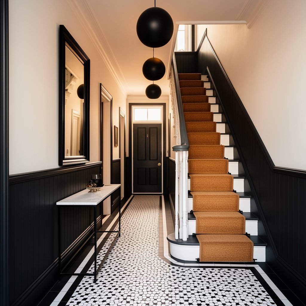
Victorian hallway floors and black and white tiles have a relationship going back a century and a half, and there’s a reason the combination has lasted. The geometric tile patterns common in original Victorian encaustic work — typically laid in a bordered design with a field pattern inside and a contrasting border around the edge — have a visual logic that suits a long, narrow space particularly well. They draw the eye forward and down the length of the hall, which makes the space feel longer and more generous than it is.
We used a hexagonal tile for the field — a classic small hex, laid in black and white in a simple alternating pattern — with a border of larger rectangular tiles in solid black running close to the walls. The border is the thing that lifts it from generic to considered: it frames the floor, gives it a finished quality, and provides a visual base for the walls above.
The tiles themselves are porcelain rather than original encaustic — more durable for daily hall use, easier to maintain, and more consistent in colour than natural materials. We used a slightly textured surface rather than a polished one, which reduces slipperiness and avoids the clinical reflectiveness that fully glazed floor tiles can have.
The junction where the hallway meets the kitchen at the rear was handled with a simple threshold strip, keeping the two floors clearly distinct rather than trying to blend them.
The Walls: Panelling as Architecture
With the floor making its statement, the walls needed to respond intelligently rather than compete. The decision we kept coming back to was panelling — specifically, a dado height panelled treatment that runs the full length of the hall on both sides, with a picture rail reinstated above and the upper wall treated differently from the lower.
The panelling is painted in a near-black — not quite a true black, but a very deep charcoal with a slight warmth to it that reads as black in most lights without having the slightly deadening quality that pure black can have on a large wall surface. The panels themselves are simple raised-and-fielded, consistent with the period of the house rather than trying to introduce a more contemporary shaker-style profile.
Above the dado, the upper wall is painted in a warm white — again, not a pure brilliant white, which would have been too harsh against the deep charcoal below and the ceiling above. We used a white with a very slight grey undertone that sits comfortably between the floor and the panelling without feeling like a compromise.
The picture rail, reinstated in white, provides the horizontal line that separates upper from lower and gives the wall composition a proper top. Without it, the transition from dark panelling to light upper wall can look like it simply ran out of paint at dado height. The rail makes it a decision.
Ceiling and cornicing are both painted in the same warm white as the upper wall, which lets the ceiling recede and makes the most of that height without drawing unnecessary attention to itself.
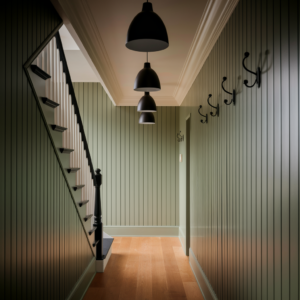
The Staircase
A black and white hallway brief naturally extends to the staircase, and this was one of the more enjoyable parts of the project.
The existing banister was, beneath its layers of white paint, a reasonable original timber balustrade with turned spindles. We stripped it back and found the timber in better condition than we’d hoped — a few repairs needed, but nothing structural. The handrail was sanded, repaired, and painted in the same deep charcoal as the panelling below. The spindles and newel post went in the warm white.
The stair treads were painted in the charcoal. The risers in white. Alternate tread and riser in contrasting tones, carried through from bottom to top, creates a rhythmic pattern going up the stair that references the floor without simply repeating it. It sounds simple and it is — but it knits the staircase into the hallway’s logic rather than leaving it as a separate element.
A stair runner was always part of the plan — both for acoustics and for the softening effect it brings to what is otherwise an entirely hard-surface space. We used a natural coir runner in a tight herringbone weave, fitted with black stair rods. The natural tone of the coir sits between the white and the charcoal without introducing a new colour — it reads as neutral, almost like a texture rather than a colour decision.
Lighting
Hallways are frequently underlit, which is a shame because light is one of the things that most affects how a space reads — especially a narrow one. We redesigned the lighting from scratch.
The single central pendant was replaced with a series of three smaller pendants on a track, evenly spaced along the length of the hall, so the whole space is lit rather than just the centre of it. The fittings are simple globe pendants in a matte black finish — a direct reference to the palette without being heavy-handed.
A wall light either side of the front door, both in matte black, provide a welcoming glow at the entrance point that doesn’t depend on the main lights being on. This is one of those small decisions that makes a big difference to how arriving home feels.
The cornicing got a concealed LED strip running behind a small shadow gap at the top of the upper wall, providing an upward wash of light onto the ceiling. In isolation this sounds like an Instagram affectation. In practice, particularly in the evenings, it adds an extraordinary amount of warmth and makes the ceiling height feel even more generous than it is.
The Details That Pull It Together
A few elements that weren’t structural but mattered enormously to the finished result:
The front door, externally painted in a classic black gloss, was repainted internally in the same charcoal as the panelling, bringing the palette right up to the threshold and giving the entrance a sense of visual intention before you’ve even stepped inside.
A simple console table — very slender, black-painted iron frame with a white marble top — sits against the wall opposite the staircase. It holds a lamp, a small plant, and nothing else. The restraint is intentional. Hallways accumulate clutter naturally; the furniture shouldn’t encourage it.
A large mirror above the console, framed in thin black metal, bounces light back along the hall and makes the space feel wider than it is. Mirrors in narrow hallways are a classic device and they’re classic because they work.
The cornicing, once properly cleaned back to its original profile, was left to make its own case. With decent ceiling height and a properly lit ceiling above it, good cornicing doesn’t need any help. It just needs not to be buried under four layers of emulsion.
What Sarah and James Said
The reveal — for want of a less reality-television word — was one of those visits where you know from the moment the client opens the front door that it’s landed. Sarah stood at the end of the hall looking back toward the front door for a long moment before she said anything. Then: “It looks like it was always meant to be like this.”
That’s the best possible outcome for a period house. Not “it looks amazing” — though she said that too — but that sense of inevitability. That the house finally looks like itself.
James, more practically, asked how easy the tiles were to keep clean. Very, as it turns out. Dark grout, sealed tiles, and a mat at the door. He seemed satisfied.
The hallway now sets a tone for the whole house — confident, considered, with a bit of drama that doesn’t take itself too seriously. Exactly what the brief asked for.