Table of Contents
Board and batten has been having a moment for a while now. Long enough, actually, that calling it a trend feels slightly inaccurate — it’s moved past trend territory into something more like a reliable design tool, one that a growing number of clients ask for by name. And there are good reasons for that. It’s graphic without being fussy. It adds architectural interest to rooms that have none. It photographs well, which matters more than it probably should. And when it’s done right, in a space that suits it, it genuinely elevates the room in a way that paint alone simply can’t.
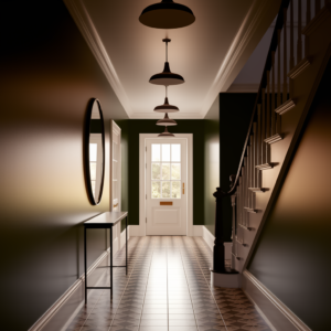
The hallway we’re talking about here belonged to a 1930s semi on the edge of a market town in the East Midlands. Decent-sized house, well maintained, but the hallway had that particular blankness that interwar properties sometimes have — the ceilings aren’t as high as a Victorian terrace, the proportions are fine but unremarkable, and there’s nothing in the architecture itself that gives the eye something to do.
The owners, a couple who’d recently moved in and were working their way through a longer renovation list, had seen board and batten on a project we’d done the year before and wanted something similar. They were clear about a few things: they wanted it to feel classic rather than rustic, they wanted a colour rather than white, and they wanted the whole hallway treated — stairs included — so it read as a single cohesive scheme rather than a feature wall that ran out of momentum halfway along.
That last point is important. A board and batten hallway treatment that stops abruptly looks unresolved. If you’re going to do it, do it properly.
What Board and Batten Actually Is
Worth a quick note on this because the terminology gets used loosely and occasionally incorrectly. Board and batten, in the wall panelling context, refers to a treatment where a flat sheet or boards are fixed to the wall and then vertical battens — narrower strips of timber — are applied at regular intervals over the top, creating a rhythm of raised vertical lines. The effect is clean and linear, with a shadow line either side of each batten that adds depth and interest.
It’s distinct from shiplap, which involves horizontal boards. Distinct from tongue-and-groove panelling, which is a different profile entirely. And distinct from raised-and-fielded panelling, which is the more traditional Georgian and Victorian approach with recessed panels rather than applied battens.
Board and batten sits somewhere between the rustic American farmhouse aesthetic — where it originated, as an exterior cladding technique — and something more formal and architectural when it’s executed with precision in an interior setting. The difference is largely in the proportions and the finish. Wide-spaced battens with a natural wood finish reads as casual. Closer-spaced battens in a painted finish reads as considered and architectural. We always push clients toward the latter when they’re using it in a main living space or a hallway, because that’s where it really delivers.
Planning the Proportions
The hallway measured about 5.5 metres from the front door to the kitchen, roughly a metre wide in the narrowest section, with a coved ceiling at just under 2.5 metres. A door to the sitting room on the left, the staircase on the right, and a coat cupboard built into the understairs space at the far end.
The first decision was height. In a room with higher ceilings, you might take board and batten to full height, or you might use it as a dado treatment — stopping at dado rail height, around 900mm to 1200mm from the floor, with a different treatment above. Given the ceiling height here, we went to full height. Taking it all the way up reinforces the vertical emphasis of the battens, which visually lifts the ceiling and makes the space feel taller than it is. In a hallway where ceiling height is already a bit modest, this is worth doing.
The batten spacing took some working out. We tried several configurations on paper before arriving at the right one — battens spaced at roughly 300mm centres, which in this hallway width created a rhythm that felt measured and deliberate without being so frequent it became visually busy. Wider spacing can look a bit sparse and accidentally suggest you ran out of timber. Tighter spacing starts to look more like ribbing than panelling. 300mm was the sweet spot for this space.
The battens themselves are 45mm wide, which is wide enough to read clearly and cast a proper shadow line, but not so wide they dominate. They stand proud of the backing board by 18mm — the thickness of the MDF used for the battens. That projection matters more than people think. Too shallow and the shadow lines are weak and the effect is flat. The depth is what gives board and batten its architectural quality.
The Build
The substrate goes up first — full sheets of 9mm MDF fixed directly to the plaster wall. This creates the flat backing that the battens sit proud of, and it also gives the whole installation a solidity that just fixing battens directly to an uneven plaster wall doesn’t provide. Older plaster walls are rarely truly flat, and any variation in the wall surface will telegraph through to the finished panel if you don’t address it at this stage. The MDF backing effectively creates a new, flat wall surface.
Sheets were fixed with construction adhesive and countersunk screws, joints kept at stud positions where possible. All joints taped and filled, any screw heads filled, and the whole surface sanded before the battens went on. This stage is unglamorous and time-consuming and absolutely not the bit clients get excited about. It’s also the bit that determines whether the finished result looks handmade or looks made.
The battens are cut from 18mm MDF, ripped to 45mm width on the table saw. Each one measured, cut to length, and fixed with adhesive and a pin nailer — no face screws, so no filling needed on the batten faces. Vertical position checked with a laser level on every single batten. This is one of those jobs where the setup time for the laser level is repaid a hundred times over in the result. A board and batten treatment with battens that aren’t perfectly vertical is immediately, obviously wrong — the eye goes straight to it.
All joints between battens and backing board, and at the top and bottom of the installation, were filled and finished to create crisp, clean lines. The top of the full-height treatment met the ceiling with a simple square-edge architrave profile, painted in with the panelling. At the base, a skirting board in a slightly deeper profile than standard replaced the existing thin skirting and gave the bottom of the installation a proper visual anchor.
Where the treatment met door architraves and the stairs, the junctions were thought through individually. The architect joint — where panelling meets an architrave at a butt junction — is always cleaner than trying to mitre around it, and in a painted finish it becomes invisible. We take our time on these junctions because they’re where the craft shows.
The Colour
The owners had come with a general direction — they wanted something dark on the lower portion and lighter above — and we’d suggested, as a starting point, a full-height treatment in a single colour rather than the two-tone approach. Our reasoning was that in this space, a single colour used consistently would create more impact and feel more resolved than a split, which can sometimes break up the vertical emphasis you’ve just built with the battens.
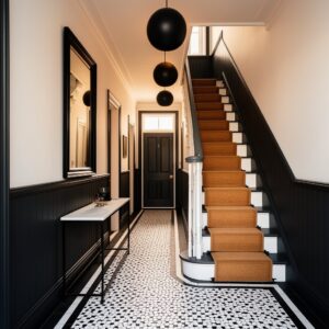
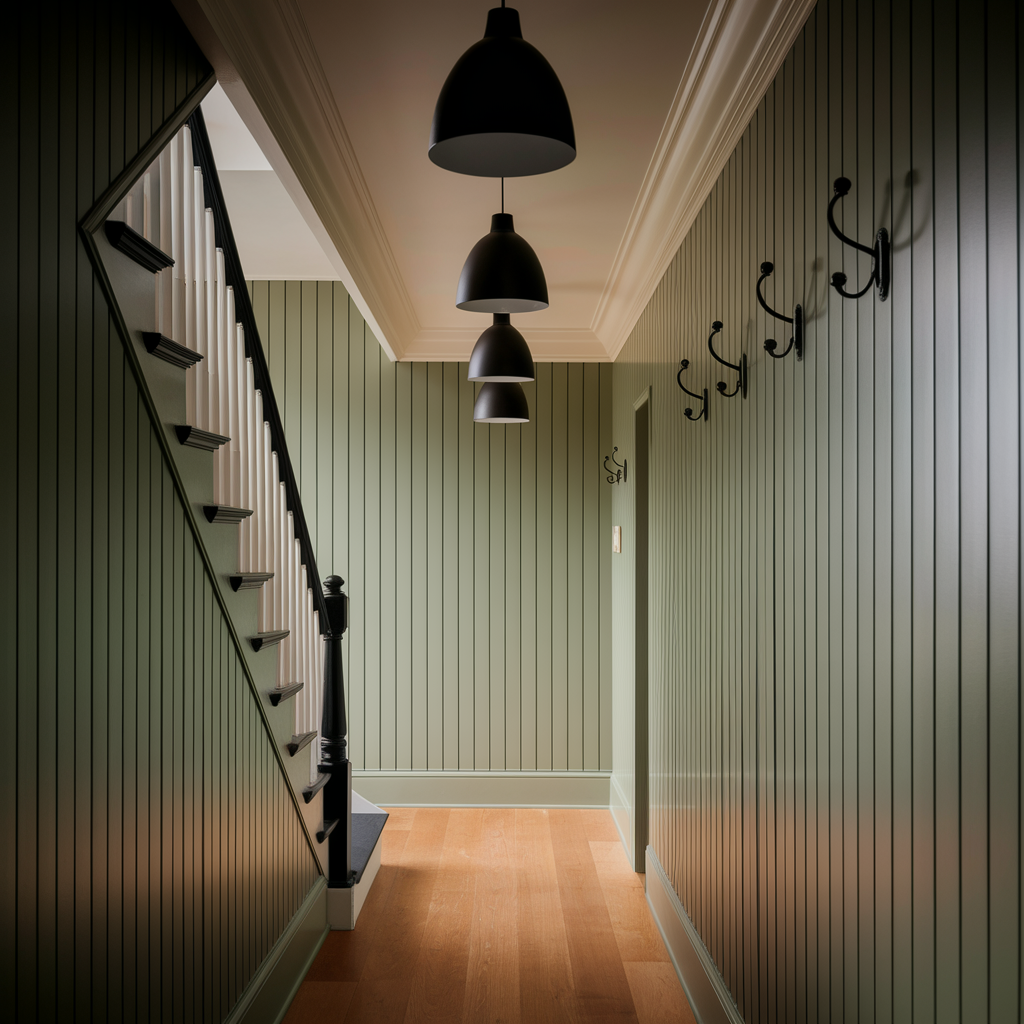
After a lot of deliberation and several sample boards on the wall, they settled on a deep sage green — a colour with enough grey in it to feel properly muted rather than botanical, and enough warmth to stop it reading as cold in a north-facing space. The full hallway in this colour, battens and all, looks nothing like you’d expect from a paint swatch. The battens create shadows that make the colour read slightly differently in different sections, giving the wall a depth and variation that a flat painted surface simply doesn’t have.
The ceiling was painted in a pale off-white — not quite white, a warm tone that picks up the warmth in the green without competing with it. The floor, which was existing oak-effect luxury vinyl, was in reasonable condition and worked with the scheme rather than against it, so we left it.
The paint was applied in two full coats after a primer coat on the bare MDF, with a light sand between coats. Finish was eggshell throughout — more durable than matt in a high-traffic hallway, and the very slight sheen picks up the shadow lines on the battens and makes them more pronounced. This is a finish detail that matters. The same colour in a dead matt loses about thirty percent of the visual effect.
The Staircase
The staircase was always going to be part of this, because the alternative — a beautifully panelled hall that stops at the foot of the stairs and abruptly becomes magnolia — would have been jarring. Carrying the treatment onto the staircase, even partially, ties it all together.
What we did here was bring the board and batten up the stair wall — the wall that runs alongside the staircase as you go up — continuing the vertical batten rhythm but adapting the batten heights to follow the stair pitch, so the top of the treatment stays parallel to the stair nosings as it rises. This takes more time than a flat wall but the result, looking up the staircase from the hall, is completely coherent. The same vertical rhythm, the same colour, carried upward.
The spindles on the staircase were stripped back and repainted in white. The handrail was stripped and painted in a deeper tone — almost a near-black that we’d used elsewhere in the house — which gives the staircase a spine, visually. The newel post the same. The treads were painted in the near-black and the risers in white, a classic combination that works because it emphasises the geometry of the stair. A stair runner was discussed but ultimately the owners decided against it, preferring the clean graphic quality of the painted treads. A reasonable call for a house without young children.
The Small Things
A few additional elements that contributed to the final result.
The existing light fitting — a single, inadequate pendant — was replaced with three smaller pendants in a matte dark finish, evenly spaced along the hallway. The fittings are simple and slightly industrial in character, which suits the graphic quality of the panelling rather than trying to contrast with it.
The coat hooks, which in the original hallway had been three mismatched items at varying heights, were replaced with a single row of matching cast iron hooks at consistent height and spacing — four of them, which is the right number for this household, positioned on the wall between the sitting room door and the staircase. The consistency matters. Random hooks on a panelled wall look provisional. Considered hooks, at the right height and spacing, look like they were always part of the design.
The understairs cupboard door was given the same treatment as the panelled wall — board and batten applied to the door face, painted in with the rest. This is a small thing that makes a big difference to the reading of the hallway as a whole. Cupboard doors that break out of the panelling treatment in a different colour or finish interrupt the visual sequence. A door that disappears into the panelling makes the whole wall feel considered.
How It Came Out
The owners’ word for it was “crisp,” which is about right. It’s a strong, confident space now — the kind of entrance hall that sets a tone for the rest of the house rather than being a neutral space you pass through without noticing. The deep sage green reads differently at different times of day, which is one of the things that happens with a colour this saturated: morning light makes it feel fresh, evening light makes it feel warm and a little moody.
Board and batten, done like this, is less of a decorating decision and more of an architectural one. You’re not just changing the colour. You’re changing the structure of the room. That’s why it has the impact it does, and why it still looks and feels current in a way that purely decorative treatments often don’t.
If you’re thinking about it for your own hallway — yes, the prep work is extensive, yes, the finishing takes longer than you expect, and yes, it’s worth every bit of it.