Table of Contents
The hallway is the room everyone gets wrong. Not because they don’t care — often they care quite a lot — but because they approach it differently from every other room in the house. They treat it as a corridor rather than a room. They pick a safe neutral and move on. Or they spend six months agonising over it because they can’t decide, and then paint it magnolia anyway. Choosing the best hallway paint colors is trickier than it looks — narrow proportions, low light, and busy traffic all change the rules
Part of the problem is that hallways present a genuinely specific set of challenges that most other rooms don’t. Limited natural light in many cases. Traffic that moves through rather than lingering. A need to work with whatever is opening off it — which might be three or four different rooms with their own colours and furniture and character. And the fact that it’s the first thing anyone sees when they enter the house, which gives it a disproportionate influence on how the whole property feels.
Get the colour right and a hallway can set a tone for an entire home. Get it wrong and it’s a slightly flat, slightly awkward space that nobody ever quite addresses. The good news is that the principles for getting it right are fairly consistent, whatever your particular house and preferences.
Here’s how we think about hallway colour, and some of the specific options we come back to again and again in our own projects.
Why Hallways Need Different Thinking
Before getting to specific colours, it’s worth understanding why standard colour-choice logic doesn’t always translate to hallways.
Natural light is the biggest variable. Most decorating advice says test your paint samples in the light conditions of the room, which is sound advice — except that many hallways have almost no natural light, or get it only briefly at certain times of day, or get it from one end only, leaving the middle of the space in permanent shadow. A colour that looks warm and inviting in a sample pot or on a south-facing wall can look muddy and cold in a north-facing hallway with no direct light.
The proportions are unusual. Most hallways are significantly longer than they are wide — sometimes dramatically so. Colour choices that work in a square or rectangular room behave differently in a space that’s essentially a tube. Colours that draw the eye down the length can make a narrow hallway feel even more tunnel-like. Colours that read as expansive in a sitting room can feel slightly overwhelming when they’re on both walls at arm’s reach.
The frequency of use matters. A hallway is crossed many times a day by everyone in the house. It’s experienced in passing, in glimpses, in the momentary impression as you come through the front door. It doesn’t need to be a colour you want to sit with for hours — it needs to make a strong, positive impression in a very short time.
And the adjacencies are everything. The hallway colour needs to function as a transition between outside and the rooms within the house. It should neither clash with the rooms opening off it nor be so determinedly neutral that it reads as an afterthought. It sets up expectations. The rooms beyond should feel continuous with it, even if their colours are quite different.
Warm Neutrals: The Reliable Foundation
Let’s start where most hallways start — with neutrals — and make the case for doing them properly rather than by default.
A warm neutral in a hallway isn’t the safe, boring choice it sounds like. The key word is warm. Cool neutrals — greys with blue or green undertones, stark off-whites — can feel clinical and unwelcoming in entrance spaces, especially in older houses where the proportions are tight. Warm neutrals — those with yellow, pink, or red undertones — do something quite different. They create a sense of welcome that’s almost physiological. You walk in and the space feels inhabited and comfortable rather than institutional.
The warm neutral category covers a wide range: soft greiges with a hint of terracotta, creamy whites that stop just short of yellow, pale putties and parchments with a faintly sandy quality. What they have in common is that they read as neither definitively beige nor definitively any other colour — they’re responsive to the light and to what’s around them, which is exactly what a transitional space needs.
In hallways with very little natural light, a warm white with a slight yellow undertone is often the best choice. It reads as white in good light but has enough warmth to glow rather than grey-out in low light, which makes an enormous difference to how welcoming the space feels on a January afternoon.
Deep, Dark Colours: Counterintuitive and Often Brilliant
Here’s the thing about dark colours in hallways that surprises most people: they often work better than pale ones, particularly in spaces with limited natural light.
The instinct is to use pale colours in a dark space, to bounce light around and compensate for the lack of windows. It makes logical sense. It also frequently produces a result that looks washed-out and slightly sorry for itself — a pale colour that’s failing to be bright, rather than a dark colour that’s confidently atmospheric.
A deep colour — a forest green, a navy, a charcoal, a rich terracotta — owns the darkness rather than fighting it. The space reads as intentionally moody rather than accidentally gloomy. Evening light, candlelight, artificial light all interact beautifully with saturated dark colours in a way they simply don’t with pale ones. And the impression on entering is one of drama and confidence — which is exactly the tone many entrance halls benefit from.
The practical consideration is that woodwork, ceiling, and any light fittings need to be right. Dark walls with dark woodwork create a very particular effect — enveloping, dramatic, slightly cave-like in a way that can be magnificent or oppressive depending on the space and the execution. Dark walls with white or off-white woodwork and ceiling create a more graphic, contained look that suits a wider range of houses.
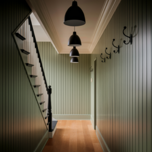
Deep green is consistently one of the most successful hallway colours across different house styles and periods. It has an outdoor quality that suits a transitional space — you’re coming in from outside, and the green provides a visual bridge. It works in Victorian terraces, in country houses, in contemporary new builds. It’s versatile in a way that navy (slightly formal) and charcoal (slightly industrial) aren’t quite.
Earthy Mid-Tones: The Currently Underused Option
Between the warm neutrals and the deep darks lies a category that doesn’t get as much attention as it deserves: earthy mid-tones. Ochres, warm terracottas, dusty pinks, clay tones, aged olive. Colours with depth and warmth but not the full intensity of a dark saturated paint.
These colours work particularly well in period houses where the palette references historical precedent — these are all colours that predate the modern era of paint chemistry and have a quality that feels timeless and slightly worn-in rather than fresh from a tin. They carry warmth effortlessly. They age beautifully. And they tend to look better than they sound when you’re standing in a paint shop holding a swatch.
A hallway painted in a warm, dusty terracotta is one of those spaces that photographs as slightly orange but in person reads as rich and welcoming and genuinely beautiful. The gap between the swatch and the room is larger for these colours than for most, which is why they get overlooked. Sample pots are essential — put them on the wall and live with them for several days before committing.
Colour and Period: Matching to the House
The age and style of the house should influence the colour palette, though not in a way that requires slavish historical accuracy.
Victorian and Edwardian houses — with their higher ceilings, stronger architectural detailing, and often more generous proportions — can carry colours that would overwhelm a more modest interwar or post-war property. Deep jewel tones, rich mid-greens, inky blues. The architecture has the strength to hold the colour.
Interwar semis and terraces — the 1920s and 30s stock that makes up a huge proportion of British housing — have a slightly different character. Lower ceilings, simpler detailing, proportions that are comfortable rather than grand. They suit colours that are warm and settled rather than dramatic: soft sage greens, warm mid-toned neutrals, dusty blues. Going too dark in a 1930s semi hallway with a 2.4-metre ceiling can feel heavy rather than atmospheric.
Post-war and later properties often have even less architectural interest to work with, which means colour has to do more of the work. Stronger colours are more forgivable here because there’s nothing the colour has to work in harmony with — the architecture is neutral enough to accommodate almost anything.
Contemporary new builds suit the whole palette, but particularly clean, slightly cool tones that respond to modern lighting and the harder-edged finishes typical of new construction.
Specific Colour Directions Worth Exploring
Rather than naming specific brands — which we tend to avoid because ranges change and regional availability varies — here are the colour characteristics and directions that come up most in our own projects.
A deep, slightly greyed navy with a hint of green in it — not quite blue, not quite teal — is one of the most versatile dark hallway options. It photographs beautifully, works well in artificial light, and suits most period house styles. It’s different enough from standard navy to avoid reading as corporate or nautical.
A warm mid-tone green with a significant grey content — the kind of green that in certain lights reads almost as sage and in others as dark olive — has been consistently successful across a lot of our own work. It’s the colour that clients most often say they nearly didn’t choose and are most glad they did.
A chalky, slightly pink-toned mid-white with just enough warmth to glow in low light is the default recommendation for hallways where clients absolutely want something pale. Not brilliant white, not cream, but something in between with a warm undertone. It does the job better than any other pale option in most situations.
A deep terracotta — not the bright tropical version but the aged, dusty, slightly brown-red you see on old Italian walls — is underused in British hallways and works beautifully, particularly in period houses with original tile floors that have warm tones in them.
Finish Matters as Much as Colour
A final point that often gets overlooked: the finish of the paint is as important as the colour, particularly in hallways.
Dead matt finishes look beautiful in photographs and in rooms with careful lighting. In a hallway that gets touched, scuffed, bag-bumped, and cleaned regularly, they show marks quickly and don’t clean easily. They’re not the right choice for the walls of a busy entrance space.
Eggshell or satin — a very slight sheen — is almost always the better practical choice for hallway walls. It’s more durable, more washable, and in spaces with any artificial light it has a quality that dead matt doesn’t: it responds to the light subtly and makes colours look slightly richer and more alive. The difference in a dark-painted hallway between a dead matt and an eggshell finish is considerable — the eggshell gives the colour a depth and warmth that matt simply doesn’t produce.
Ceilings in dead matt white, woodwork in full eggshell or semi-gloss — that’s the combination that works consistently well. The contrast between a slightly sheened wall and a more robust woodwork finish is part of what makes the space read as properly finished.

The One Thing That Makes the Biggest Difference
Sample pots. Three or four of them. Applied in large patches — at least A3 size — directly on the wall, in the actual hallway, over a white primer base. Left for at least 48 hours and assessed at different times of day and under artificial light in the evening.
No other shortcut works. Paint swatches lie. Colour matching apps lie. The photo from someone else’s hallway on a design website is lit by a professional photographer who has made that colour look its absolute best. Only the actual paint on your actual wall, in your actual light conditions, tells the truth.
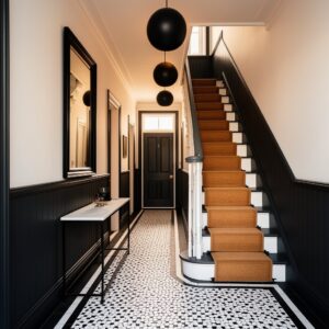
Take that seriously and the rest of the decision follows naturally. Don’t forget our article on a really nice black and white hallway project.