Table of Contents
Choosing colors for a playroom is one of those decisions that sounds simple — children like bright colors, playrooms should be fun, therefore paint it something vivid and be done with it — and turns out to be considerably more nuanced than that initial logic suggests. The colors that look great in a mood board can feel overwhelming in a real room. The colors that seem too cautious on a swatch can produce exactly the right quality of calm energy in practice. And the colors chosen to suit a four-year-old’s current obsession tend to feel dated embarrassingly quickly.
The best colors for a playroom are the ones that support what the room is actually used for — active play, creative work, social interaction, and increasingly as children get older, quieter focused activity — while remaining genuinely liveable for the years the room serves that function. That’s a different brief from making the room look exciting in a photograph, and the difference matters more than people usually account for when they’re standing in the paint shop.
What Color Does in a Playroom
Before getting to specific colors, it’s worth understanding what color is actually doing in a room children spend significant time in.
Color affects mood, energy levels, and the perceived character of a space in ways that are physiological as well as aesthetic. Warm colors — reds, oranges, yellows — are stimulating. They raise energy levels and create a sense of warmth and activity. In small doses in the right context, that’s desirable in a playroom. In large doses on all four walls, it can produce a room that feels frantic rather than fun, one that makes sustained quiet activity — reading, drawing, building — harder rather than easier.
Cool colors — blues, greens, certain purples — are calming. They lower the perceived energy of a space and make focused activity easier. Again, the dose matters: a very cool, very saturated blue on all four walls in a playroom can feel institutional rather than inviting.
The middle ground — the colors that are warm enough to feel lively without being overwhelming, or cool enough to feel calm without being clinical — is where most successful playroom palettes sit. These tend to be colors with some complexity to them: greens with warmth in them, blues with a hint of teal, yellows that have been pushed toward ochre rather than left at full brightness.
Light reflectance also matters more in a playroom than in most rooms. A dark, saturated color on all four walls absorbs light, which makes a room feel smaller and, in a space that children are active in, slightly more contained than is comfortable. Keeping the ceiling white or very pale regardless of what’s happening on the walls preserves the sense of height and openness that active play needs.
The Case for a Considered Neutral Base
The approach that consistently produces the most successful playrooms — the ones that work well and continue to work well as children get older — is a neutral or near-neutral base with color introduced through furniture, textiles, artwork, and specific accent elements.
This doesn’t mean magnolia. A warm mid-tone — a soft sage green, a muted dusty blue, a warm putty or stone — on the walls gives the room a settled identity without committing to a palette so specific that it outgrows itself in two years. Against this base, color can be introduced as freely as the children’s personalities demand: bright rugs, colorful storage boxes, painted furniture, wall art that changes as tastes change.
The practical argument for this approach is the repainting cost. A playroom repainted entirely in deep yellow because of a current obsession with sunshine and then repainted three years later because nobody likes that anymore is an expensive way to redecorate. A warm neutral base with changeable accent elements manages the same personality through the accessories, which are cheaper and quicker to replace.
The aesthetic argument is equally strong. A room with a complex, layered palette — neutral base, complementary accents, strong features in the furniture and textiles — has more visual depth and more design quality than a room painted a single vivid color regardless of the quality of the color itself.
Colors That Work Particularly Well
Pulling from projects we’ve done and from a considered understanding of how color behaves in rooms used by children, these are the directions that come up most often and most successfully.
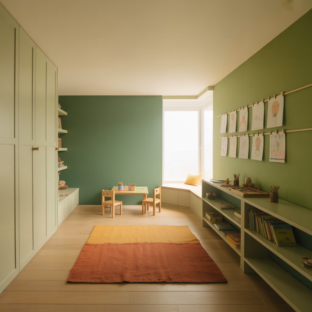
Sage green and its close relatives. Muted green — the kind that reads as somewhere between grey-green and olive depending on the light — is one of the most consistently successful playroom colors. It has enough warmth to feel inviting rather than clinical, enough calm to support focused activity, and enough visual interest to feel like a considered choice rather than a default. It references nature in a way that children respond to positively, and it ages well — a sage green playroom doesn’t date the way a trend color does.
Against sage green, complementary accents in warm terracotta, mustard yellow, or deep rust work beautifully and are easy to introduce through cushions, storage, and artwork without painting anything.
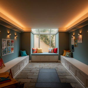
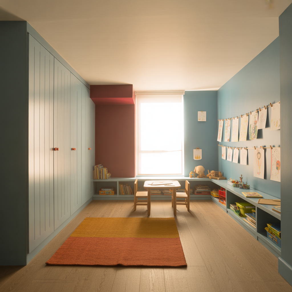
Warm dusty blue. Not a bright primary blue, not a grey-blue, but something in between — a blue with warmth in it, slightly desaturated, that reads as calm and settled without feeling cold. This works particularly well in playrooms with good natural light, where the warmth of the sun takes the edge off any coolness in the color. Dusty blue with white woodwork and ceiling is fresh without being clinical.
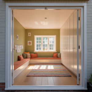
Warm white with a strong accent wall. The approach that gives maximum flexibility — warm white on three walls and ceiling, with one wall in a stronger, more committed color. The accent wall provides the visual impact and the sense of a designed space, while the three pale walls keep the room light and ensure the strong color doesn’t overwhelm the space.
For the accent wall, the choices that work best are those that anchor rather than agitate: a deep forest green, a rich navy, a warm terracotta, a dusty plum. These are colors with depth and character that make a wall feel intentional rather than merely bright.
Warm yellow — carefully chosen. Yellow is the color most often requested for children’s playrooms and the one most often regretted in its execution. The problem is almost always the specific yellow rather than the principle of yellow. Bright, highly saturated primary yellows — the ones that look most vivid on a paint chart — produce rooms that feel relentless at full wall coverage. A warm, slightly muted yellow — something that references sunshine without trying to replicate it, that has some ochre or amber in its undertone — is a completely different proposition. In the right room with good light, a warm yellow of this kind is genuinely beautiful.
Test extensively before committing. Yellow is the color most affected by light conditions, and the sample on the chart bears the least reliable relationship to the color on the wall of any shade in the spectrum.
Bold on the ceiling — an underused approach. A pattern or color on the ceiling of a playroom is a relatively low-commitment way to add drama to a space where small people spend a lot of time looking upward. A deep blue ceiling with a few stars, a warm green with a simple cloud motif, a ceiling painted in a complementary color to the walls — these are features that delight children specifically because they look at the ceiling in a way that adults mostly don’t. And they can be changed without repainting the whole room.
Colors to Be Cautious With
Full-saturation primary colors at wall coverage. Red, bright orange, and highly saturated primary yellow as the dominant wall color in a playroom almost always produce spaces that feel more intense than pleasant for extended periods. These colors work beautifully as accents. At wall coverage, they tend to create rooms that are energising for twenty minutes and exhausting for the subsequent two hours.
Very dark colors throughout. A dark playroom — deep navy, charcoal, forest green on all four walls — can work on a feature wall or in a specific zone, but throughout it produces a room that needs significant artificial light to function during the day, which is a practical and energy cost. Children need light for the kind of play that involves detail — drawing, building, reading — and dark rooms make this harder.
Highly themed, highly specific colors. The specific shade of a particular cartoon character’s outfit, the exact color of a dinosaur, the brand-specific palette of a current toy range — these produce rooms that feel exciting for the duration of the obsession and alienating immediately afterward. General colors in the spirit of the obsession rather than its exact palette are more sustainable.
Pure brilliant white. Playrooms are going to get marked, scuffed, painted on, drawn on, and generally subjected to the kind of use that makes maintenance a realistic concern. Pure white is the color that shows every mark, requires the most frequent repainting, and produces a clinical quality that’s more doctor’s waiting room than children’s sanctuary. An eggshell or satin finish in a warm near-white is both more forgiving and more welcoming.
Finish Matters as Much as Color
In a playroom, the finish of the paint is arguably more important than in any other room in the house, because the surfaces are going to be cleaned frequently and subjected to more physical contact than almost anywhere else.
Dead matt finishes absorb marks and are difficult to clean. They’re beautiful in theory and impractical in a room used by children. Matt or flat emulsion should not be used on playroom walls.
Eggshell is the minimum appropriate finish — it offers a slight sheen that makes it considerably more washable than matt, while avoiding the very high gloss that makes marks and imperfections visually prominent. For walls that are going to take the most contact — around the door, near a drawing area, at child height generally — a satin finish provides even better washability.
The woodwork and any painted furniture should be in a full eggshell or satin at minimum, with semi-gloss appropriate for high-wear areas. Playroom woodwork in dead matt paint needs repainting within months; in the right finish it can go years between coats.
Getting the Children Involved
This is the part of playroom color selection that’s both the most obvious and the most frequently done badly. Involving children in the color choice of their room is genuinely valuable — it gives them ownership of the space and usually produces color decisions that are more interesting than the adult’s cautious defaults. The risk is a five-year-old’s unconstrained color choice producing a room that feels unliveable to everyone including the five-year-old within a year.
The approach that works: narrow the options to three or four colors that you’re genuinely happy with regardless of which is chosen. Within those options, the child chooses. This produces the best of both approaches — considered adult editing combined with genuine child autonomy. The child feels the room is truly theirs. The room is also genuinely pleasant to be in.
For older children, the conversation about color can be more sophisticated — what do you want the room to feel like, what colors make you feel energised versus calm, what would you want someone to notice when they first walked in. Children from about eight upward can engage with these questions seriously and produce preferences that inform the design in genuinely useful ways.
The Longer View
A well-chosen playroom color scheme is one that still makes sense when the youngest child is using the room as a teenager. That’s the real test — not whether it looks fun in a photograph when the children are six and eight, but whether it’s a room that grows with them rather than one that has to be completely reinvented every few years.
Colors with some complexity to them — the muted greens, the warm dusty blues, the considered neutrals with strong accents — age far better than the highly saturated, age-specific choices that feel most exciting at the point of choosing. The room that will serve a family for a decade is almost never the room that looks most like a children’s room at the moment of its creation.
That’s the counterintuitive truth at the heart of playroom color selection, and it’s the one worth sitting with before the paint goes on the wall.