Table of Contents
Mudroom paint colors deserve more strategic thinking than they typically receive. Most people choose a mudroom color the same way they choose a hallway color — reaching for something pale and neutral because it seems appropriate for a transitional space, because it might make a small room feel larger, or simply because the decision feels low-stakes and they have other things to think about. The result is a mudroom that shows every handprint, every scuff mark, and every smear of outdoor debris in unforgiving detail, and that requires repainting with a frequency that starts to feel like a punishment.
The smarter approach — the one that produces a mudroom that looks good consistently rather than looking good the week after it’s painted — is to choose colors that work with the realities of the space rather than against them. Deep blues, earthy grays, rich greens, moody terracottas: these are the colors that absorb visual noise rather than highlighting it, that improve with a lived-in quality rather than deteriorating, and that turn the most hard-working room in the house into something that feels genuinely designed.
Why the Pale Mudroom Fails
Let’s spend a moment on why the instinctive approach — pale colors to keep a small room light and airy — tends to produce disappointing results in a mudroom context specifically.
A mudroom’s function is to be the transition point between outdoors and indoors. It receives everything that comes in from outside: mud, sand, water, sports equipment, dog paws, school bags dragged along the wall, small hands that haven’t been washed yet. In a pale room, every piece of this is immediately visible. A streak of dried mud on an off-white wall is hard to miss. A scuff mark at school-bag height on a pale greige wall announces itself. And pale colors, painted in the flat or low-sheen finish that most people default to in secondary spaces, clean poorly — marks that wipe off a harder finish leave a ghost on a soft flat surface.
The deeper problem with pale mudroom colors is psychological as much as practical. A mudroom that always looks slightly dirty — because the color reveals every mark — starts to feel perpetually shabby regardless of how often it’s cleaned. The effort goes in and the result doesn’t show. That’s demoralising, and it’s entirely avoidable.
The Case for Dark and Moody
Deep, saturated colors in a mudroom solve multiple problems simultaneously, and the solution feels counterintuitive until you’ve lived with it.
Marks and scuffs on a deep color are simply harder to see. This isn’t because the room is dirty — it’s because the eye struggles to distinguish between the color and a slightly darker variation of it the way it can’t fail to notice a dark mark on a light surface. A scuff on a deep navy wall requires you to be looking for it. A scuff on an off-white wall presents itself.
Deep colors also age differently from pale ones. A pale wall that’s been in a high-traffic space for two years looks worn. A deep-colored wall in the same space looks slightly more settled, slightly more patinated, slightly more itself. The wear works with the color rather than against it.
There’s a design argument too. A mudroom in a bold, confident color makes the transition from outside to inside feel like a destination rather than a threshold. It sets a tone that the rest of the house can respond to. And it demonstrates that the room has been thought about — which is true of a well-designed mudroom and should be visible.
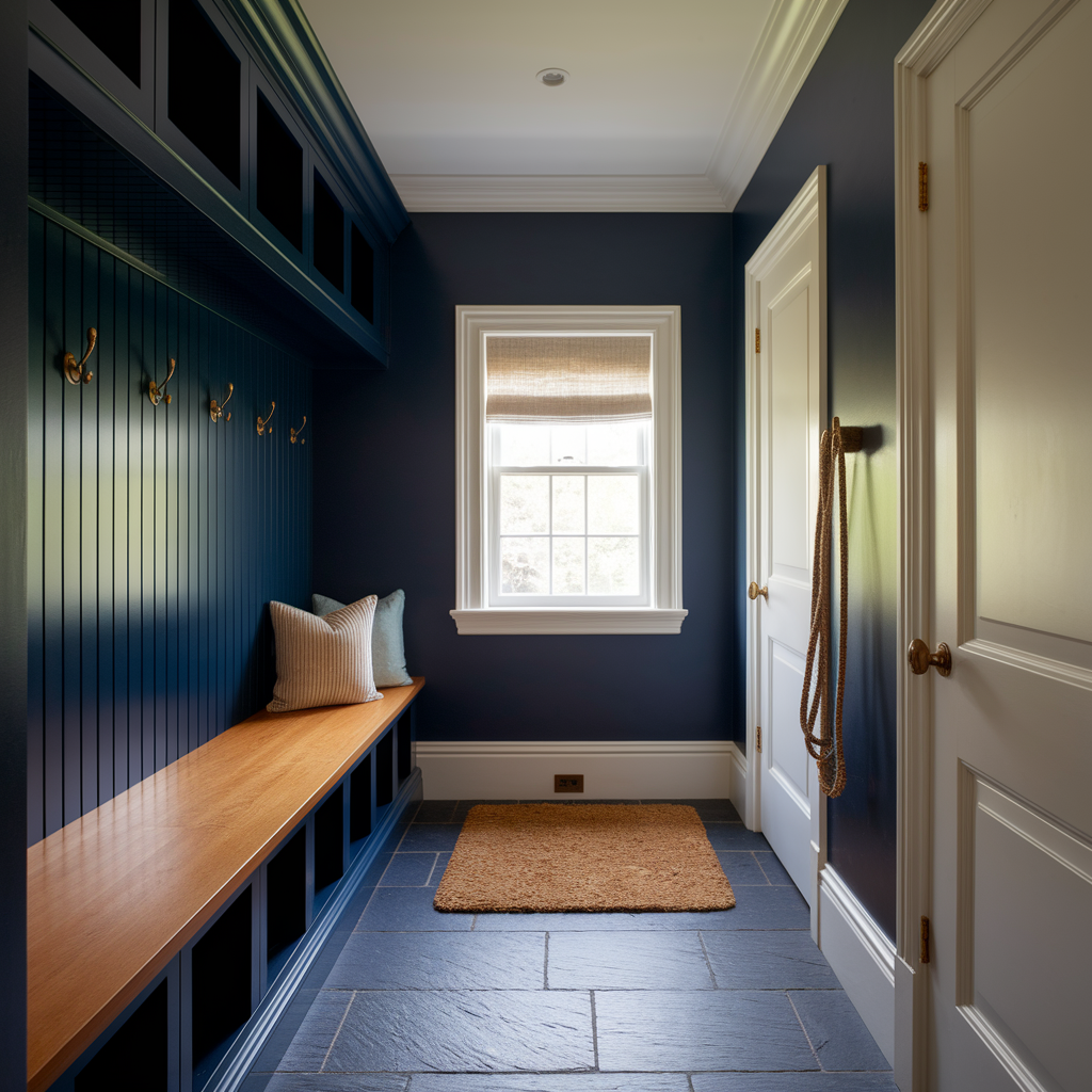
Deep Blues: Confidence That Hides Everything
Deep blue is probably the most consistently successful category for mudroom paint, and the reasons are both practical and aesthetic.
Practically: deep blue sits in a value range that makes marks and scuffs visually quiet. The color is dark enough to absorb visual noise without being so dark that it makes a small space feel like a sealed box. The cool undertone of most deep blues contrasts effectively with the warm, earthy tones of mud and outdoor debris — which means even when the room is working hard, the color reads as itself rather than as dirty.
Aesthetically: deep blue reads as deliberate and grown-up in a way that few other mudroom colors do. It’s associated with quality — naval architecture, formal tailoring, fine ceramics — and those associations carry into a domestic space in a way that makes it feel considered rather than default. A mudroom in deep navy with white woodwork and natural timber storage reads as a proper room rather than a utility afterthought.
The specific blues that work best in a mudroom are those with enough darkness and richness to do the practical job. A mid-blue — the kind that reads as clearly blue in direct light — is too light to reliably camouflage marks. The sweet spot is a blue that reads as almost-navy in most lights: dark enough to have real depth, not so dark that it becomes visually heavy in a narrow space. Blues with a slight green undertone — moving toward teal without arriving there — work particularly well because the green warms the color and prevents it from reading as cold in the typically limited light of a mudroom.
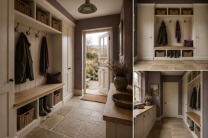
Paired with: warm white woodwork and skirting, brass or bronze hardware on hooks and storage, and a natural material on the floor — stone, slate, or a durable tile — deep blue mudroom colors read as intentional and complete. The warmth of the natural materials compensates for the coolness of the color and produces a scheme that feels balanced.
Earthy Grays: The Color That Disappears Appropriately
Earthy gray — not the cool blue-gray that dominated interiors for a decade, but the warmer, more complex version with hints of brown, green, or ochre in it — is one of the most practical mudroom colors precisely because it sits in the middle of the value range in a way that makes it genuinely neutral in terms of revealing marks.
A warm gray at a mid-to-dark value reads as neither light enough to show dirt clearly nor dark enough to attract attention. It’s the color of stone, of concrete, of natural slate — materials that are themselves associated with the outdoors and with durability. In a mudroom, where the function is to process outdoor life, a color that references outdoor materials has a logic that paler colors don’t.
The earthy grays that work best have a greenish or brownish undertone rather than a blue one. Blue-grays can look slightly industrial and cold in a mudroom context — particularly in a north-facing space with limited natural light. A gray with warmth in it — something that reads as warmer and more alive under artificial light in the evening — produces a more welcoming entry experience.
At the deeper end of the earthy gray range — approaching charcoal, but warmer and browner — you arrive at a color that does the most practical work. Charcoal-adjacent earthy grays are particularly effective in mudrooms used by working dogs, since dog mud is inevitably brown and reads least on a color that already contains brown as an undertone. This is a very specific application but a very real one for anyone who’s tried to keep a pale mudroom clean with a pair of spaniels in the household.
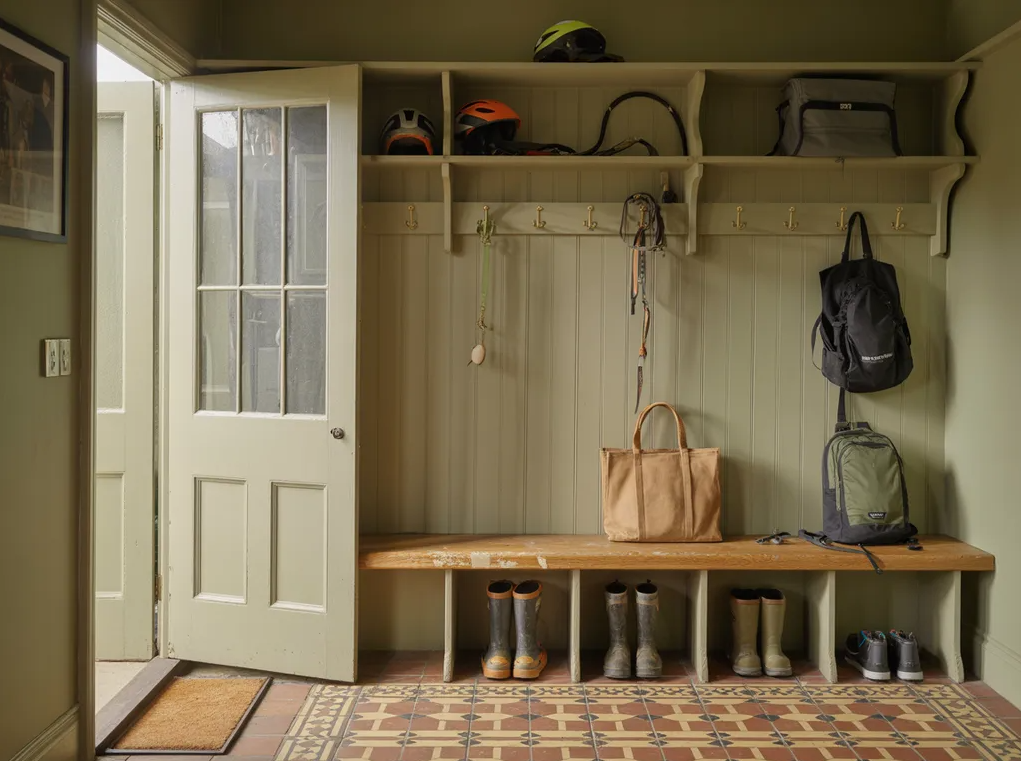
Moody Greens: The Outdoor Connection
Green in a mudroom has a specific logic that works particularly well: the color connects the interior to the outdoors in a way that makes the transition from garden to house feel continuous rather than abrupt. A deep, muted green — the kind that references forest, hedgerow, or moss rather than the bright botanical green of a garden center — gives a mudroom a quality of belonging that no other color category quite produces.
Deep olive is one of the most practically successful mudroom greens. It sits in a dark mid-range value that camouflages marks effectively, its warm yellow-brown undertone makes it forgiving of the earthy debris that mudrooms collect, and it reads as sophisticated rather than rustic. Olive against white woodwork and natural stone or slate flooring is a combination that has worked in rural British interiors for generations and continues to work for the same reason it always has: it’s right for the context.
Forest green — deeper, cooler, more saturated — is the bolder choice. It takes a confident commitment to dark color and rewards that commitment with a mudroom that looks genuinely dramatic rather than merely functional. Forest green reads best with brass or antique bronze hardware, with natural timber elements, and with a warm stone or terracotta floor — materials that prevent the coolness of the green from dominating.
The muted sage end of the green family — lighter and more gray-toned — is less effective practically because it sits in a value range closer to the pale colors that reveal marks, without being dark enough to absorb them reliably. Sage is a better living room or kitchen color than a mudroom color, despite its current ubiquity in residential interiors.
Warm Terracottas and Earthy Reds: The Unexpected Option
This is the category that most people don’t consider for a mudroom and that, in the right context, produces some of the most characterful results.
A deep, dusty terracotta — the aged, slightly brown-red of old Italian walls, nothing bright or tropical — has exactly the right practical properties for a mudroom. Its warm red-brown undertone is specifically forgiving of the earthy, brown-toned marks that characterise mudroom use. Mud on terracotta is genuinely difficult to see. This isn’t a coincidence — terracotta is essentially the same material as dried mud, which means the color is naturally camouflaged against it.
Beyond the practical logic, terracotta gives a mudroom warmth that genuinely makes it welcoming. Coming in from a cold, grey day into a mudroom painted in a deep warm terracotta is a different experience from coming into the same room in deep navy or charcoal gray. The warmth is almost physical. It’s one of those color effects that’s difficult to predict from a swatch and immediately obvious in the finished room.
The pairing options for terracotta are more constrained than for the cooler options. White woodwork can work but sometimes reads as too sharp a contrast. A warm off-white — something with a hint of cream — is better. Natural materials in warm tones — timber hooks, a jute runner, clay-colored tiles — make the scheme feel resolved. Chrome or cool-toned metals fight with it.
The Finish Question: Why It Matters Here More Than Almost Anywhere
The choice of paint finish in a mudroom is arguably more important than the color itself, and it’s the decision most often made without sufficient attention.
Dead flat and traditional matt finishes are wrong for mudroom walls. They’re beautiful in theory and impractical for a surface that will be touched, scuffed, and cleaned hundreds of times a year. Flat paint marks easily, cleans poorly, and requires repainting rather than wiping. In a space that takes as much physical punishment as a mudroom, a flat finish means the paint deteriorates within months and the room looks tired within a year.
The minimum appropriate finish for mudroom walls is eggshell — a very slight sheen that makes the surface washable without introducing a reflectiveness that feels inappropriate for a residential space. Eggshell in a deep, dark color is genuinely excellent: the slight sheen catches the light subtly and makes the color look richer and more alive than flat, while being practical enough to wipe down properly when needed.
Satin is the next step up and is often the right call for mudrooms used intensively — by multiple children, by working dogs, by a household that actually uses the outdoor access the mudroom provides rather than using the front door exclusively. Satin is noticeably more washable than eggshell, and in a dark color the additional sheen is less visually prominent than it would be in a pale one.
Full gloss on walls is too reflective for most residential mudrooms and makes imperfections in the wall surface prominent. Reserve gloss for the woodwork — skirting, hooks, door frames — where its durability is appropriate and its reflectiveness reads as intentional.
A Note on the Color Beyond the Walls
The wall color is the dominant decision, but a mudroom scheme includes more than walls. A few considerations that complete the picture.
The ceiling in a mudroom is almost always white or very near white, regardless of the wall color. In a space with lower ceiling height — which many mudrooms have — the white ceiling is essential for keeping the room from feeling too enclosed. In a larger mudroom or one with better proportions, a tinted ceiling in a lighter version of the wall color can be used with good effect, but it’s the more demanding choice.
The floor is the element that works hardest of all and that’s most often chosen for pure practicality. Dark floor tiles — slate, dark stone effect porcelain, even dark-stained engineered timber with an extremely durable finish — work well with deep wall colors and have the additional practical advantage of matching the wall color in the visual noise they conceal. A pale floor in a deep-colored mudroom creates a strong contrast that can look good in photographs and challenging in daily life when the floor shows everything the boots bring in.
The woodwork color — skirting, door frames, any built-in bench or cubby faces — is the element that frames the wall color and either completes it or undermines it. Warm white against deep blue. Slightly aged off-white against terracotta. Matching the wall color in the woodwork — a monochromatic approach — works for very dark walls and produces a particularly resolved, high-design result. For most mudrooms, a contrast between wall and woodwork is the more accessible and more forgiving choice.
Choosing Without Samples Is Always a Mistake
The mudroom-specific version of this advice: test your chosen color in the specific light conditions of the mudroom, not in the kitchen or the hallway where the light is better. A deep navy that looks rich and inviting in south-facing light can look murky and flat in a north-facing mudroom with one small window. A terracotta that glows warmly under warm artificial light can look slightly garish under cool fluorescent. The only test that counts is paint on the wall, in the room, observed at different times of day and under the artificial light that will actually be used.
Large patches — at least A4, ideally A3 — directly on the wall. Left for 48 hours. Assessed morning, midday, evening, and under artificial light. If it looks right under all of those conditions, it’s right. If it looks right under some and wrong under others, the decision needs more consideration.
The colors described here consistently perform well in mudroom conditions. The specific version of each color that performs best in your specific mudroom is the one that looks right on your specific wall.