Table of Contents
The mud room has spent the better part of a decade painted in various shades of gray. Cool gray, warm gray, blue-gray, greige — the whole family has had a turn, and while the results have been perfectly respectable, something about the conversation around the mud room is changing. People are moving away from the austere, slightly clinical quality that gray can produce in a transitional space and toward something that feels more welcoming, more natural, more connected to the outdoors it mediates between.
The shift makes sense when you think about what the mud room is actually for. It’s the decompression zone between the outside world and the private world of the house. It’s where the school run ends and the weekend begins, where the muddy boots come off and the day’s accumulated energy starts to settle. A gray mud room is fine. A warm, nature-inspired mud room is better — because warmth in that transitional moment changes how arriving home feels, subtly but genuinely.
These five palettes represent the direction the mud room conversation is heading. Each is built around a warm, cozy, nature-inspired base, and each includes enough practical thinking to work in a real room rather than just on a mood board.
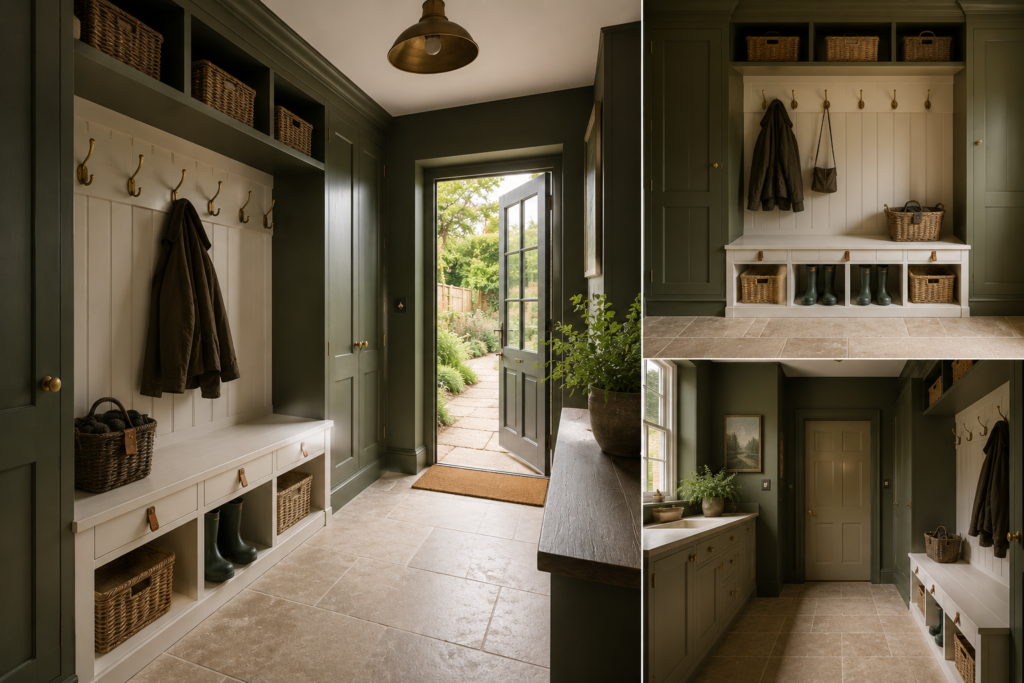
Palette One: Forest Floor
Walls: Deep moss green — a green with significant brown content, like the underside of a forest leaf rather than the bright surface. Dark, complex, earthy.
Woodwork and bench: Warm off-white, just enough cream in it to prevent it reading as stark against the deep green.
Storage and hooks: Antique or unlacquered brass — the kind that develops a slightly varied patina rather than staying uniformly gold.
Floor: Natural stone or a stone-effect porcelain in a warm beige-grey tone. The warmth in the floor stone softens what might otherwise be a heavy green-on-white contrast.
Accents: Aged leather on hook straps or small leather pulls on drawers, a wicker basket or two for gloves and hats.
This palette does what good mud room colors should do — it creates a strong visual identity without announcing itself as a design statement every time you walk through the door. The moss green reads as organic and settled rather than deliberately stylish, which means it ages well. Three years from now, a room in this palette will look more established rather than more dated.
The practical performance is also excellent. A deep earthy green is forgiving of mud, garden debris, and the general brownish outdoor material that a mud room collects. The value of the color is dark enough to absorb visual noise and the warm undertone means that the inevitable marks read as variations on the color rather than violations of it.
Best for: houses with gardens, countryside properties, any home that feels a connection to the outdoors and wants the mud room to reflect it.
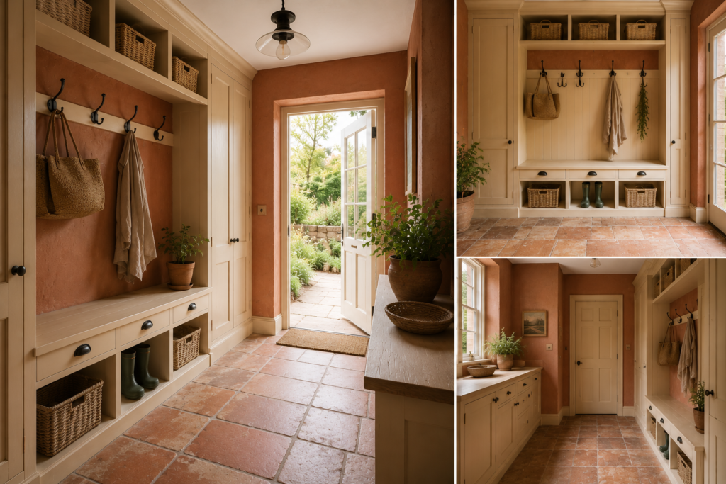
Palette Two: Warm Clay
Walls: A dusty terracotta — specifically, the aged variety. Not bright orange-red but the faded, slightly pink-toned, sun-bleached version you find on old farmhouse walls in southern Europe. Matte or eggshell finish.
Woodwork: Warm cream — warmer than white, with a definite hint of yellow. Against the terracotta it reads as natural and easy rather than stark.
Storage and hooks: Black iron or dark bronze. The cool darkness of the metal provides the contrast the palette needs without introducing anything cold or metallic in character.
Floor: Terracotta encaustic tile or a convincing ceramic equivalent — if the budget allows it, the real thing, with its slight colour variation and texture. If not, a warm stone-effect tile in the same family as the wall color.
Accents: Natural raffia, jute, undyed linen. Baskets rather than boxes. A small plant in an unglazed terracotta pot.
This is the palette for a mud room that wants to feel like it was always there — that has the quality of rooms that were decorated decades ago with natural materials and have simply continued to look right ever since. There’s a lack of effort to it that takes considerable effort to achieve, which is the paradox at the heart of the natural materials movement in interior design.
The warm clay palette is one of the most practical for mud rooms with significant outdoor use. The terracotta color is, almost literally, the same material as dried mud — which means the floor and walls are naturally forgiving in a way that no other palette quite matches.
Best for: period cottages, farmhouses, any home with a strong connection to craft and natural materials.
Palette Three: Autumn Canopy
Walls: A deep ochre — not bright yellow but the deeper, more amber-toned version of it. The colour of dried oak leaves, of raw honey, of aged beeswax. Rich and warm, dark enough to have presence.
Woodwork: White, pure this time — the one case in these five palettes where a clean white rather than a creamy white is the right call, because the warmth of the ochre provides all the warmth the room needs and the white gives a clean, graphic frame.
Storage: Painted in a deeper version of the ochre, slightly more saturated, which gives the cabinetry depth relative to the walls.
Floor: Dark slate or a very dark charcoal tile — the contrast between the dark floor and the warm amber walls creates a visual grounding effect that prevents the deep ochre from feeling unanchored.
Accents: Burnished copper — copper-toned hardware rather than brass, which reads as slightly warmer and more amber-adjacent. A woven rug in a flat weave if the floor allows it. Something dark green, which sits in complementary relationship to the amber-ochre walls.
This is the most confident of the five palettes — the one that commits to color most fully and requires the most conviction to execute well. A mud room in deep ochre with dark slate floor and white woodwork is genuinely striking. It photographs well, it looks deliberate, and it makes a specific statement about the house it belongs to.
It’s also the least forgiving in a smaller or darker mud room. Deep ochre needs either natural light or warm, well-designed artificial light to look warm rather than brown. In a poorly lit space it can tip toward a slightly dingy quality. Test in the actual room extensively before committing.
Best for: larger mud rooms with good light, Victorian and Edwardian houses, households that want a genuinely distinctive entrance and are prepared to commit to the palette in full.
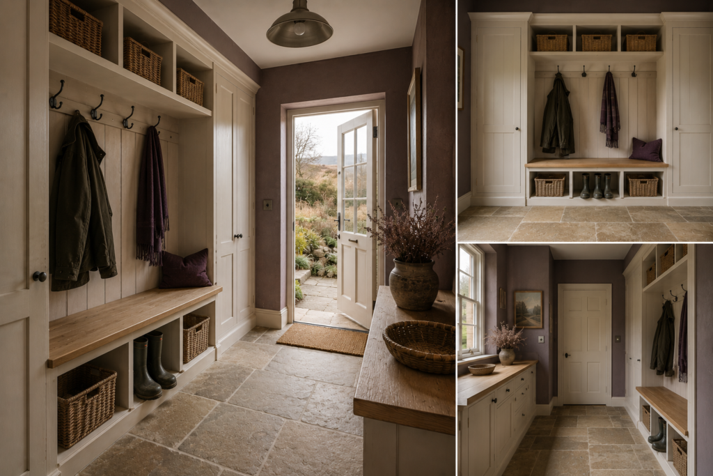
Palette Four: Morning Mist on the Moors
Walls: A warm heathered tone — somewhere between purple, brown, and gray, the colour of dried heather, bracken, and moorland grassland in autumn. Muted, complex, almost impossible to name precisely. Warm-neutral in undertone but with just enough purple to prevent it reading as another brown.
Woodwork: A deep, slightly warm white — the same family as antique linen or aged paper. Against the heathered wall it reads as natural and uncontrived.
Storage and seating: Natural oak — left in its natural tone, lightly oiled rather than stained, with the warm honey of untreated timber.
Floor: A mid-tone stone — York stone effect, or real York stone if the budget and context allow. The warm grey-gold of Yorkshire stone is the natural companion to heathered moorland tones.
Accents: Aged pewter rather than brass — cooler and more complex. Dark plum in textiles if any softness is introduced. Simple iron coat hooks in a blackened finish.
This is the most unusual of the five palettes and the one that works hardest to distinguish itself from everything that’s been done in the last decade. The heathered tone is not a color that appears often in residential interiors, which means a mud room built around it reads as genuinely individual rather than as another version of something widely seen.
It’s also supremely practical — the complex, multi-undertone nature of the color means that virtually nothing shows up against it as a mark, because the color itself has so much variation built in that additional variation becomes invisible.
Best for: rural and semi-rural properties in northern England and Scotland, houses where the landscape outside informs the choices inside, anyone who wants a mud room that couldn’t be confused with anyone else’s.
Palette Five: Honey and Stone
Walls: A warm, pale honey tone — a very light amber, almost white but undeniably yellow-warm. The palest of the five palettes and the one that most obviously departs from gray while remaining accessible and unfussy.
Woodwork: Warm white, matching or very close to the wall colour — a near-tonal approach that makes the room feel softer and more cohesive.
Storage: A deeper version of the honey tone for lower units and bench — slightly darker than the walls, creating a shadow effect at the base of the room that grounds the pale palette.
Floor: Pale limestone or a warm light stone-effect tile. The floor and walls share a value range that makes the room feel seamless and airy — appropriate for a smaller mud room where the other four palettes might feel too heavy.
Accents: Natural brass. Linen. A thin-profile iron hook strip in a raw or graphite finish. The combination of warm brass and cool iron provides a material contrast that prevents the palette from feeling too uniformly soft.
This is the palette for anyone who has been living with gray and wants warmth without drama. It’s the most accessible of the five — the easiest to achieve and the least likely to produce a surprising result. That’s its limitation as well as its virtue. It won’t produce a mud room that stops visitors in their tracks, but it will produce a mud room that feels genuinely welcoming every single day rather than just on the days when you’ve noticed it.
Honey and stone is also the best palette for connecting the mud room to adjacent spaces. A pale honey tone has the easiest relationship with most kitchen and hallway colors, which means the transition between the mud room and the house doesn’t require any careful color bridging.
Best for: smaller mud rooms, houses with pale or neutral adjacent spaces, anyone who wants a perceptible shift from gray toward warmth without making a statement.
The Principles Behind All Five
These five palettes share underlying principles that go beyond the specific colors.
Every one of them chooses warmth over coolness. The shift away from gray is really a shift away from cool undertones — the blue and green in gray that makes it feel crisp in the right context and cold in the wrong one. Every palette here has warmth baked into the base, whether that warmth comes from yellow (the honey and ochre palettes), red (terracotta and heather), or green-brown (the forest and moorland palettes).
Every one of them treats the floor as a serious decision rather than an afterthought. A warm-colored mud room on a cheap pale laminate or a generic white tile loses half its quality. The floor material and color is part of each palette specification, not optional.
Every one of them uses natural materials as accent and textural elements — leather, brass, iron, timber, stone, linen, jute. Natural materials work with warm-toned palettes in a way they don’t with cool ones, because they share the same family of warmth and earthiness. The synthetic equivalents — chrome, plastic, polished laminate — introduce a quality that jars against the nature-inspired direction.
And every one of them treats the mud room as a room rather than a utility corridor. The color confidence of these palettes only works if everything else — the storage, the lighting, the detailing — is at the same level. A deep forest green on the walls of a room with inadequate storage and a strip light produces a different result from the same color in a room that’s been properly designed. The palette is the final layer of a considered room, not the substitute for one.
That’s the underlying principle of all good mud room design: the color doesn’t do the work, but it completes it.