Table of Contents
Warm white is one of those paint categories that sounds simple and turns out not to be. People reach for it constantly — it’s probably the most requested colour direction in residential interiors — and yet it goes wrong with surprising regularity. The wrong warm white in the wrong room at the wrong time of day can look dingy, yellowed, or flat in a way that the person who chose it didn’t anticipate and can’t quite explain. The right one, in the right context, makes a room feel as though it’s gently lit from within even on the greyest February afternoon.
The difference between those two outcomes is partly about the specific paint — warm whites cover a vast range, from barely-there cream to something approaching a full antique yellow — and partly about the room itself. Because warm white doesn’t behave the same way everywhere. The light conditions, the materials around it, the orientation of the room, the height of the ceiling — all of these determine whether the warmth reads as golden and inviting or as slightly grubby and unresolved.
Understanding which rooms suit warm whites, and what kind of warm white works in each, is more useful than any list of individual paint names. The principles are transferable; the specific colours are just the delivery mechanism.
What Makes a White Warm
Worth establishing this clearly, because “warm white” gets used to cover quite different things.
Warm whites derive their warmth from undertones of yellow, red, orange, or pink. In small quantities, these undertones give the white a glow — a quality of reflected light that cool whites (which have blue, green, or grey undertones) don’t produce. The warmth doesn’t have to be obvious or consciously registered. The best warm whites don’t look yellow or cream at a glance; they just look right in a way that their cooler counterparts don’t in the same situation.
The spectrum runs from barely-warm — a white that’s just a fraction away from a pure neutral, with the lightest possible yellow or pink tint — through to quite pronounced creams and parchments that are clearly in warm territory. Where on that spectrum you want to sit depends on the room, the light, and how much the warmth needs to work to counteract the conditions.
Warm whites also interact differently with the colours and materials around them. They bring out the warmth in natural timber, in terracotta tiles, in aged metals and warm-toned fabrics. They can fight with cool blues and greys, making both look slightly off. This adjacency effect matters just as much as the absolute colour of the room itself.
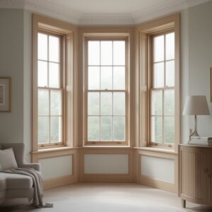
Living Rooms: Where Warm White Really Earns Its Keep
The living room is probably the environment where warm white works most consistently well, and where the case for it over a cool alternative is easiest to make.
Living rooms are used heavily in the evening, under artificial light, and in the UK that means a significant proportion of total time spent in the room is under lamplight rather than daylight. Under incandescent and warm LED lighting, a warm white wall comes alive in a way that a cool white simply doesn’t. The warmth in the paint resonates with the warmth in the light source, and the room takes on a quality that feels genuinely welcoming and human in scale — the kind of room that makes people want to stay in it rather than pass through.
The other factor in living rooms is furniture and soft furnishings. Most living rooms contain a mix of warm tones — natural timber floors or furniture, linen or wool upholstery, books, rugs — and a warm white wall integrates with these materials in a way that a stark cool white holds itself apart from. The wall becomes part of the warmth of the room rather than a neutral backdrop to it.
In terms of which warm whites work best in living rooms, the answer usually depends on the quality and quantity of natural light. A south or west-facing living room that gets good afternoon sun can carry a slightly more pronounced warm white — even a very pale cream — without it looking yellowed, because the light quality is already warm enough to balance it. A north-facing living room with limited direct light needs a more subtle warm undertone, because stronger creams in limited daylight can tip into looking tired rather than warm.
Kitchens: The Case For and Against
Kitchens are interesting because the argument for warm white is strong but the choice within the category is particularly critical.
The case for warm white in a kitchen rests on the amount of time spent there and the mix of materials that typically make up the space. A kitchen is somewhere people spend real time — cooking, eating, existing — and the quality of the light and the feeling of the space matters in a sustained way. Warm whites work well with natural timber worktops and cabinetry, with stone and ceramic tiles in warm tones, with the general material palette of a kitchen that’s been put together with some thought.
The case against, or at least the caution, is this: kitchens are also where colour temperature of artificial lighting is most variable, and warm whites can tip into looking dirty or old in certain light conditions. The overhead lighting in many kitchens is cooler than the ambient lighting in living rooms — task lighting often is — and under cool fluorescent or daylight-temperature LEDs, a warm white wall can look unexpectedly grimy. The fix is usually to specify warmer-temperature bulbs throughout the kitchen, which has the added benefit of making the whole space feel more hospitable.
White kitchen cabinets are their own sub-question. Warm white cabinets and warm white walls with a very close tonal match can look slightly flat and undifferentiated. A slightly different tone between the two — warmer cabinets against a fractionally cooler wall, or vice versa — adds depth and prevents the whole room reading as one continuous surface.
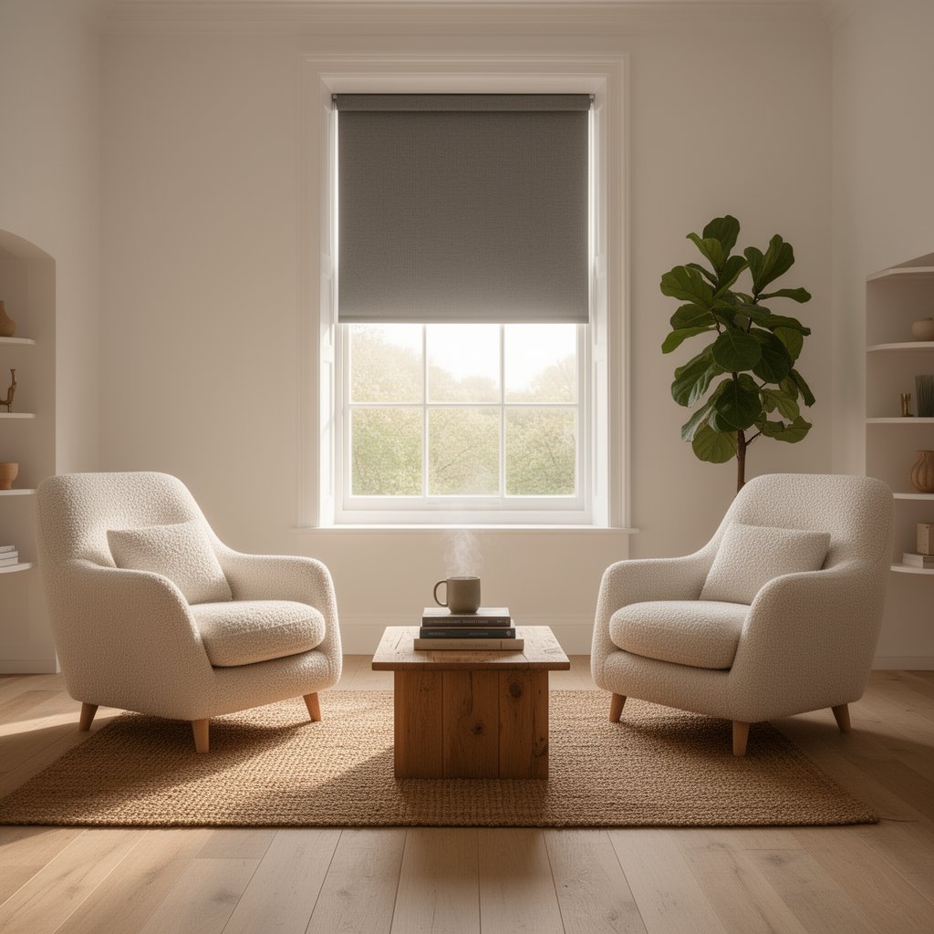
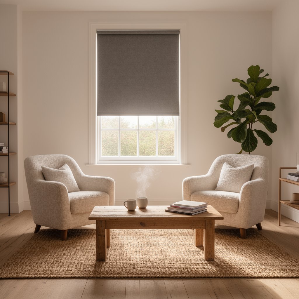
Bedrooms: The Most Forgiving Room
Bedrooms are arguably the easiest room to use warm white well, because the conditions that allow warm white to perform at its best — soft, warm artificial light, a preponderance of fabric and natural materials, low-light use in the evening — are exactly the conditions that bedrooms naturally provide.
A warm white bedroom wall under a warm bedside lamp is one of the most consistently pleasant environments in a house. The softness of the colour and the quality of the light combine into something that feels genuinely restful and right. There’s a reason that warm white is the default choice for hotel rooms that have been thought about — not the generic hospitality-beige that dominates budget accommodation, but the proper warm white of rooms designed to feel luxurious and relaxed.
In bedrooms the choice of warm white can be quite pronounced without it reading as yellow, precisely because the light conditions are so favourable. A pale antique white or a very light parchment, which might look slightly strong in a north-facing sitting room, often looks beautiful in a bedroom because it’s almost always experienced in warm artificial light. It feels like candlelight without anyone having actually lit a candle.
The one consideration in bedrooms is the ceiling. Many people extend the warm white to the ceiling without changing the tone, which works well — it gives the room a cohesive, enveloping quality. A slightly paler or cooler white on the ceiling lifts it away from the walls and makes the room feel taller, which can be useful in rooms with modest ceiling heights. Neither approach is wrong; it’s a spatial decision more than a colour one.
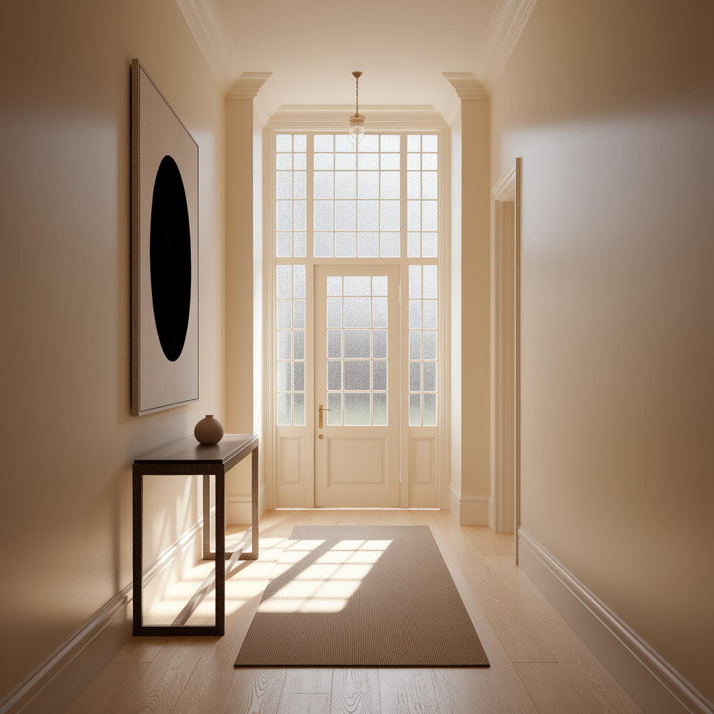
Hallways and Entrance Halls
The hallway is typically the hardest room to light well and the one where warm white does some of its most useful work.
Most hallways have limited natural light — often just a fanlight above the front door, perhaps a window at the far end if the layout permits, rarely anything approaching the daylight levels of the main rooms. In these conditions, warm white compensates for what the light can’t provide. It glows rather than sitting flat; it makes the space feel inhabited and welcoming rather than transitional and slightly sorry for itself.
The warm white choice in a hallway should generally sit at the more subtle end of the spectrum — a barely-warm white with just enough yellow or pink to prevent it reading as cool, but not so pronounced that it makes a low-light space look yellowed. The ceiling, which often catches what little light there is, can reasonably match the walls here rather than contrasting, which creates a unified, enveloping effect that works well in a narrow space.
The other consideration is what the hallway leads to. If the rooms opening off it are in deeper or bolder colours, the warm white hallway functions as a calm, neutral introduction before the more decisive colour statements of the rooms themselves. If the adjacent rooms are also in lighter tones, the continuity reads as a cohesive whole rather than a series of separate decisions.
Bathrooms: Where It Gets More Complicated
Bathrooms are where warm white advice most often goes wrong, and they deserve a more careful treatment than other rooms.
The appeal is clear: a warm white bathroom feels spa-like and relaxed rather than clinical, and tile and sanitaryware in warm white tones have a softness that bright whites don’t. The complication is that bathrooms typically have cooler artificial lighting than other rooms — often cooler even than kitchens — because task lighting around mirrors is conventionally specified at a higher colour temperature for accuracy. Under this light, warm whites can look dirty.
The practical solutions are either to specify genuinely warm-temperature lighting throughout the bathroom (which makes the mirror less useful as a task light but makes the room feel better) or to keep the warm white to the areas away from the mirror and accept a slight colour temperature mismatch as part of the design. A third option is to use warm white on fixtures and tiles but a very neutral, barely-warm white on the walls, which gives the material warmth without committing fully to it in the flat vertical surfaces.
Warm white works best in bathrooms that have some natural light — even a frosted window — which provides a reference point against which the warmth reads correctly. Fully internal bathrooms with no natural light are the hardest environment for any warm white.
Home Offices and Studies
This is an interesting case where the warm white question has a more nuanced answer than in most rooms.
Home offices are used predominantly in daylight hours, often under a mix of natural and artificial light, for tasks that require sustained visual attention. In these conditions, the restful quality of warm white is a genuine asset — it reduces visual fatigue in a way that both stark cool whites and stronger colours don’t, and it makes the room feel comfortable for extended use.
The consideration is screen use. If most of the work in the space involves looking at screens, the wall colour behind and around the screens affects perceived contrast and eye strain. Very warm whites, particularly those with enough yellow to read as cream, can create a warm cast that makes screen calibration feel slightly off — a minor thing for general use but potentially irritating for anyone doing colour-critical visual work. For most people it’s not relevant. For graphic designers, photographers, or anyone whose work involves colour accuracy, a cooler and more neutral white is the right call regardless of its other merits.
For a general home office or study — reading, writing, calls, general computer use — a warm white is simply a very pleasant environment to work in. Calmer than strong colour, warmer and more human than a cool neutral.
Rooms That Don’t Suit Warm White
It would be misleading to talk only about where warm white succeeds without noting where it struggles.
Rooms with a lot of strong cool colour — a bathroom with deep navy tiles, a sitting room with a blue-grey sofa that’s doing most of the visual work — can be pulled slightly off balance by warm white walls. The warmth in the white fights with the coolness of the dominant colour rather than sitting in harmony with it. A very neutral or slightly cool white is often better in these situations, letting the dominant colour read cleanly rather than muddying the colour temperature.
Rooms with very low ceilings can also find warm whites limiting — the colour absorbs more light than a cool white would, and in a room that’s already fighting for height, that absorption can make the space feel smaller. A very pale, barely-warm white is the compromise, or a decision to go to a cool white on the ceiling specifically.
And rooms that are already warm in material terms — a south-facing conservatory or garden room full of terracotta and timber and bright daylight — sometimes don’t need warm white to do any work at all. In these environments, a clean neutral or even a very slightly cool white allows the materials and the light to speak without the paint colour pushing in the same direction. The warmth is already present; the wall doesn’t need to contribute more.
Choosing Within the Category
The final practical note: warm white is a category, not a specific paint, and the range within it is vast. Getting the right warm white for a specific room requires testing rather than choosing on faith from a swatch.
Apply sample patches — large ones, at least A3 — directly on the wall in the actual room. Observe them at several points during the day: morning, midday, afternoon, and under artificial light in the evening. The colour that looks right under most or all of those conditions is the one to use. The colour that looks slightly wrong under any of them is worth questioning before committing.
Pay attention to the undertone specifically. Hold a piece of pure white paper next to the sample and the undertone becomes immediately visible — whether it’s yellow, pink, or something else. Understanding the undertone helps predict how the colour will behave next to the other materials in the room.
And take seriously the finish as well as the colour. Warm whites in an eggshell finish have a quality and depth that flat matt can’t quite match, particularly in rooms that are used in artificial light. The slight sheen picks up and reflects the warmth of the light in a way that dead matt absorbs. In hallways and kitchens especially, the practical durability argument for eggshell over matt reinforces what’s also the better aesthetic choice.
Warm white, chosen well, is genuinely one of the most versatile and rewarding paint decisions available. The difficulty isn’t finding it — it’s knowing exactly which one for exactly where.