Table of Contents
There are paint colours that require explanation and colours that just work. Sherwin Williams Pure White paint — SW 7005, if you’re looking it up — falls firmly into the second category. It’s one of those whites that you use on a project, stand back, and think: yes, that’s exactly right. And then you use it on the next project, and the one after that, and at some point it stops being a conscious choice and starts being the default.
We’re not the only ones who’ve arrived at this position. Pure White is consistently one of the most specified whites in residential interior design on both sides of the Atlantic, and there are good reasons for that beyond the power of brand recognition. It earns its reputation every time.
Here’s what we’ve learned about it through actual use — where it excels, where it needs a bit of thought, and why it keeps coming back to the top of the list.
What Pure White Actually Is
The name does a reasonable job of describing it, but it’s worth being precise about what you’re actually getting in the tin.
Sherwin Williams Pure White has an LRV — Light Reflectance Value — of 84. That puts it in high-reflectance white territory, lighter than most off-whites and creams, but noticeably softer than the highest-reflectance whites in the range. Pure bright whites sit at LRV 90 and above; they’re the whites that bounce light aggressively and read as very clean and clinical in most settings. At 84, Pure White has enough softness to feel approachable without tipping into the territory of a warm cream.
The undertones are the key to understanding why it works the way it does. Pure White carries a very slight yellow undertone with a touch of black — the yellow gives it just enough warmth to prevent the icy edge that cooler whites develop in certain light conditions, and the black takes the edge off any tendency to tip too warm. The RGB values back this up: 237 red, 236 green, 230 blue. Marginally more red and green than blue, which places it in subtly warm territory without announcing the fact loudly.
The practical effect of this combination is a white that reads as clean and fresh — genuinely white, not cream, not beige — but that doesn’t feel stark or institutional. It has enough character to feel intentional in a room without imposing that character on everything around it.
Why It Works Across Different Light Conditions
One of the things that distinguishes Pure White from many other whites in the same LRV range is how consistently it performs across varying light conditions. This matters enormously in practice, because a white that looks beautiful in a south-facing showroom and clinical or yellowed in a north-facing bedroom is only half a solution.
Pure White handles the shift from natural to artificial light, and from warm to cool natural light, better than most. The yellow undertone is calibrated closely enough to neutral that it doesn’t over-respond to warm light sources — it doesn’t yellow under incandescent or warm LED lighting the way a more pronounced warm white would. But it’s warm enough that under cooler north light it doesn’t go grey or blue in the way that pure cool whites do.
We’ve used it on north-facing rooms and south-facing rooms on the same project and had it read consistently well in both. That kind of reliability is genuinely useful when you’re specifying a colour for a whole house rather than a single carefully considered room.
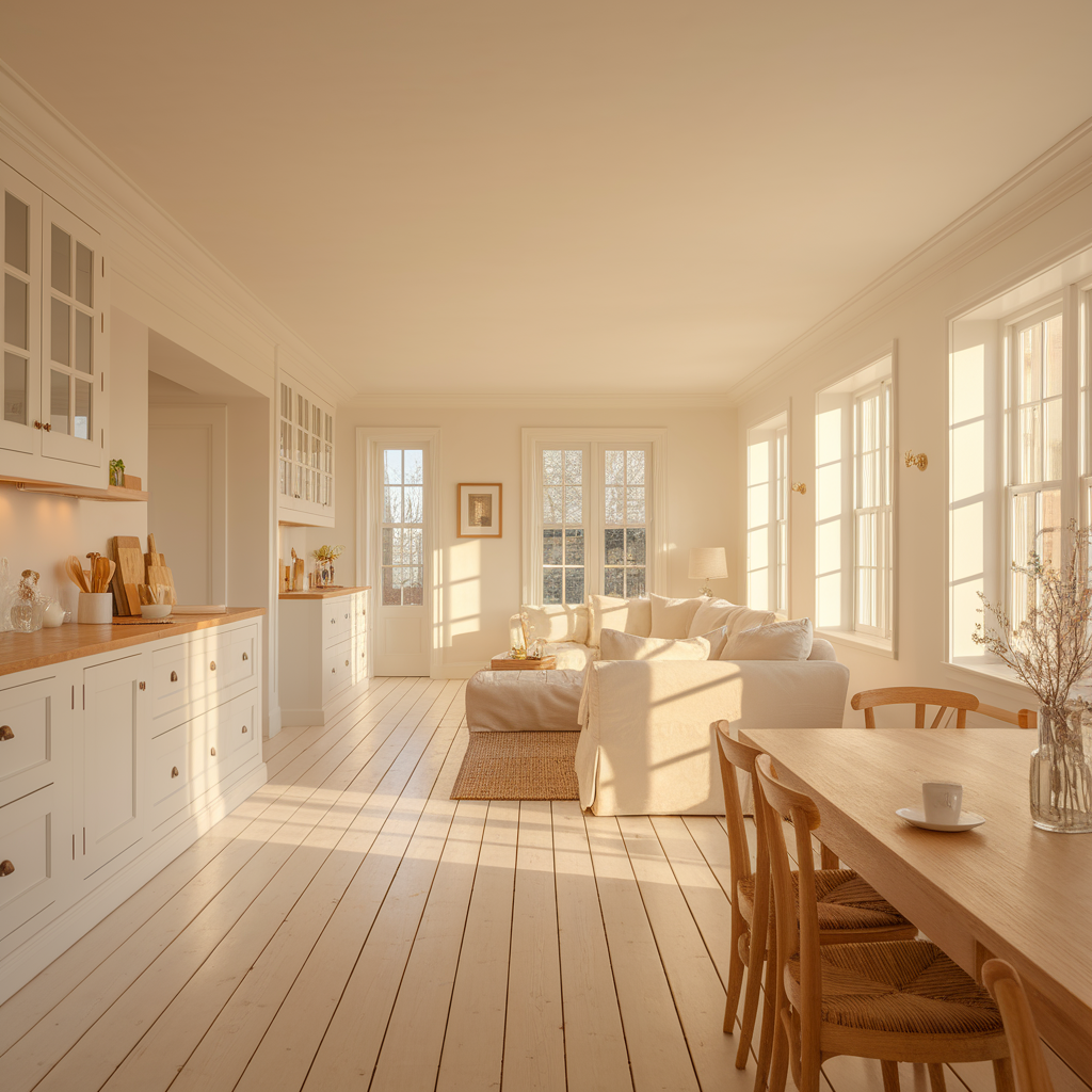
On Walls
This is where most people start with Pure White, and where its near-neutral quality is most evident. On walls, it creates what’s often described as a gallery white effect — the clean, bright, slightly warm backdrop that makes both artwork and furniture look their best without the wall colour competing with them.
It’s particularly good in rooms with a mix of warm and cool elements — where the furniture palette includes both natural timber and cooler metals or stonework, for instance — because it doesn’t push strongly in either direction. It sits between them and lets the room work as a whole rather than enforcing a particular temperature on the space.
One thing to know: in very large rooms with a lot of wall surface, Pure White can appear slightly more pronounced in its warmth than it does in smaller spaces. This is a function of the volume of colour rather than any change in the paint itself, but it’s worth bearing in mind. A large open-plan space with considerable wall area in Pure White can feel warmer than expected. Usually that’s a pleasant surprise rather than a problem, but it’s worth anticipating rather than discovering after the fact.
On Trim and Woodwork
This is, genuinely, where Pure White does some of its best work. White trim paint has specific requirements that wall paint doesn’t: it needs to hold its own against whatever wall colour is adjacent to it, it needs to be the thing that pulls the eye to the architectural details, and it needs to look clean and fresh rather than yellowed or grey.
Pure White does all three. Against warm wall colours, it reads as clean and bright without jarring. Against cooler wall colours — mid-greys, blues, greens — it provides warmth that prevents the trim from disappearing into the wall. And on its own terms, on a white-on-white scheme where walls, trim, and ceiling are all in varying whites, it sits comfortably in the middle of the register without fighting with the others.
The only caveat is the finish choice. Trim in a satin or semi-gloss finish will reflect slightly differently from walls in eggshell or matte, and the same paint colour can look fractionally different between the two surfaces as a result. This is normal and expected, but if matching trim to walls very precisely is a priority, test both finishes on the actual surfaces before committing.
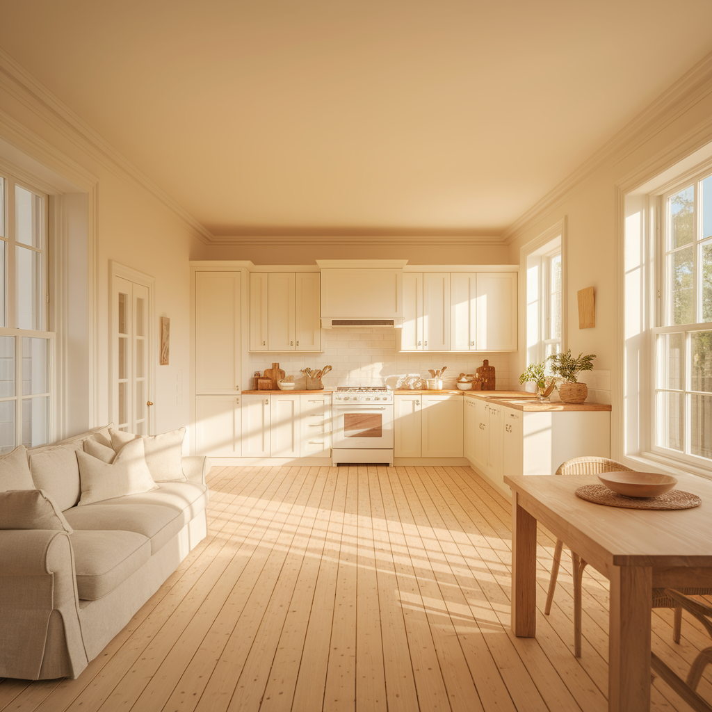
On Cabinets
Kitchen and bathroom cabinet use is where Pure White has become particularly trusted, and where the specific technical properties of the paint matter beyond just the colour.
On kitchen cabinets, the question is always the same: will it yellow over time, will it mark easily, and will it look right under kitchen lighting conditions? Pure White performs well on all three counts when the right product formulation is used — the colour’s LRV and undertone combination means it holds its identity under the cooler overhead lighting that kitchens often have, and the subtle warmth prevents it from looking surgical or overly stark against the harder materials that make up most kitchen environments.
The yellowing question is the one cabinet painters get asked most often, and the honest answer with Pure White is that the undertone is subtle enough that even if there is slight colour shift over time, it moves very slightly toward cream rather than toward an obvious yellow. It ages more gracefully than more pronounced warm whites.
On bathroom cabinetry, the same principles apply. Pure White against a white tile or white sanitaryware setting reads as consistent and clean. The slight warmth in the white differentiates it from the cooler whites often found in ceramic tile glazes, which gives the cabinets a slight visual separation that reads as intentional rather than mismatched.
On Ceilings
Ceiling white is a specific discipline, and many designers default to a dedicated ceiling white rather than carrying a wall colour up. For whole-house schemes where continuity matters, using Pure White on ceilings as well as walls is a legitimate approach — the LRV is high enough that it reads as ceiling white rather than a wall colour that’s just migrated upward.
Where Pure White on the ceiling differs most noticeably from a standard bright ceiling white is in the warmth. Under artificial light particularly, a Pure White ceiling has a glow to it that a high-LRV cool white doesn’t produce. In rooms where the lighting is warm-toned — living rooms, bedrooms, dining spaces — this is a real asset. The ceiling becomes part of the warm envelope of the room rather than a distant, slightly cool surface above it.
Where It Works Best: Room by Room
Pulling together the experience of using it across a range of settings, these are the environments where Pure White consistently performs best.
Open-plan spaces benefit from Pure White’s near-neutral quality. In a space that incorporates kitchen, dining, and living functions with different materials and colour temperatures throughout, a white that holds steady rather than responding differently in each zone is genuinely valuable.
Rooms with mixed lighting — particularly those that transition between daylight and evening lamplight as the main light source — suit Pure White well because it handles both conditions without overcorrecting.
White-on-white interiors, where the design intention is to create a tonal study in whites rather than using white as a backdrop for colour, work particularly well with Pure White as one of the primary players. It sits well with both warmer and cooler whites, which makes it useful as a reference point when building a layered white palette.
Period properties with timber floors, skirting boards, and doors benefit from the slight warmth in Pure White, which resonates with the warmth of the timber rather than sitting in cold contrast to it.
A Few Honest Caveats
No paint is right for every situation, and Pure White has specific conditions under which it performs less well.
In rooms with very strong cool tones — a bathroom tiled entirely in cool grey, a kitchen with dark blue cabinetry and steel worktops — the subtle warmth in Pure White can occasionally read as slightly at odds with the surrounding palette. In these settings, a cooler, more neutral white sometimes integrates better.
In spaces where maximum brightness and crispness is the priority — a photography studio, a graphic design workspace, a room specifically designed to maximise perceived light in a very dark setting — the LRV of 84 and the slight warmth may not give you what you need. A higher-LRV, cooler white will perform better in these specific circumstances.
And as with any white, Pure White needs good preparation and appropriate finish choices to look its best on cabinets and trim. The colour is forgiving; a poor surface or a low-quality topcoat is not.
Why It Keeps Coming Back
The reason Sherwin Williams Pure White paint stays in regular rotation isn’t because it’s the most exciting colour decision we make on a project. It’s because it’s reliable in a way that matters more, in practice, than excitement. It doesn’t surprise you unpleasantly. It doesn’t look different on the wall from how you expected. It doesn’t fight with things around it or require constant management of what else is in the room.
A really good white is the kind of colour that disappears into the background of the design and lets everything else do its job. That’s exactly what Pure White does, consistently and across a remarkable range of contexts. For a colour that’s ostensibly just white, that’s a fairly significant achievement.